

https://instituteforglobalaffairs.org/wp-content/uploads/2024/06/IGA-Modeling-Democracy-2024-The-New-Atlanticism.pdf
You must log in or register to comment.
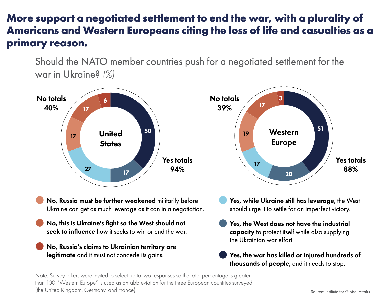
Weird graph, I personally found the way or representing that data a little unclear. Why not use a piechart with percentages of the answers.
Also is there a grammar mistake? As in "No, Russia's claims to Ukraine territory are legitimate...", shouldn't that be illegitimate?
Apart from that, it's nice to see that people don't fall for the propaganda trap, and still value human life's.
Looks like people were allowed to select up to two answers, but it also looks like they're obfuscating the level of consensus and making the "no" votes take up a disproportionately large amount of the final visual graph size.

