I think "modern" can be interpreted as nice and clean UI which is beautiful to watch and only the absolutely most important stuff is shown and the rest is hidden. So, like apple design approaches, I guess. Say form over function.
Microsoft tends to go that route as well. Luckily for user who like function over form, there are different flavors of Linux.
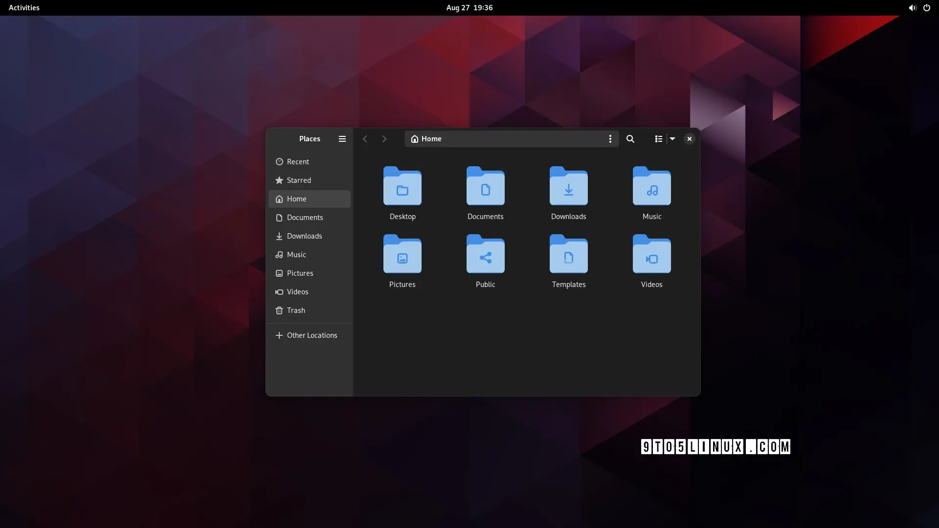
Clearly the dark mode is the modern one! Jokes aside, I just realized that there THREE menu options on that toolbar: hamburger, kebab, and waffle! I realize they do different things, but no wonder people are confused by and scared of computers. Also, now I'm hungry!
as someone who's not scared of computers, i have no idea what they do. i assume the right one is icons/list/compact[1] not a waffle menu, but the hamburger and kebab? i have no clue
though why it's showing list when the current view is icons, i don't know either ↩︎
It's just my opinion (since it's not in the article) but a thing that makes Gnome and Libadwaita a "modern design" is the fact that the production behind it tries to bridge the gap between a "mouse and keyboard" and a "touch screen" workflow.
None of the other DEs come even close to Gnome when used on a tablet
meh, subjectively i find that creates a "worst of both worlds" situation. but this comment was more about the futility of the development time that went into this specific feature
this comment was more about the futility of the development time that went into this specific feature
yeah sorry, I should have been more specific with my answer: features like this are supposed to help you in a touch screen situation or in general with smaller screens.
When the window is resized under a certain size, the left panel becomes hidden and with it part of the top bar, to make it less cluttered and confusing.
The difference is minimal, in the newer version you have 1 less element when the sidebar is collapsed (the hamburger menu).
Generally speaking Gnome 44 is already well optimized, 45 is going to be a more "tweaks and small improvements" kind of update rather than a big design changes
i'm not even sure it's worth having an option. i don't think i'd even have noticed a difference, apart from the menu button being in a slightly different place to every other gnome app. it's fine; but it wasn't worth the development time

who even decides what's "modern" anymore?
can anyone, honestly, without reading the article (or guessing from the headline), tell me which of these is the "modern" design?
*removed externally hosted image* *removed externally hosted image*
edit: people are getting confused by the fact that one is tree view, not icons view so i changed the image. old image here
Apparently "modern" means hiding options behind extra clicks
i may be blind but what exactly was hidden behind one or more clicks?
deleted by creator
I think "modern" can be interpreted as nice and clean UI which is beautiful to watch and only the absolutely most important stuff is shown and the rest is hidden. So, like apple design approaches, I guess. Say form over function. Microsoft tends to go that route as well. Luckily for user who like function over form, there are different flavors of Linux.
Clearly the dark mode is the modern one! Jokes aside, I just realized that there THREE menu options on that toolbar: hamburger, kebab, and waffle! I realize they do different things, but no wonder people are confused by and scared of computers. Also, now I'm hungry!
as someone who's not scared of computers, i have no idea what they do. i assume the right one is icons/list/compact[1] not a waffle menu, but the hamburger and kebab? i have no clue
though why it's showing list when the current view is icons, i don't know either ↩︎
Corpo's and social media "designers" who would throw out their own mother because she's "outdated"
Honestly as someone who doesn't use Gnome... I can't really tell much of a difference, Seems like a strange thing to build hype over.
as a GNOME user I also don't get the hype lol
It's just my opinion (since it's not in the article) but a thing that makes Gnome and Libadwaita a "modern design" is the fact that the production behind it tries to bridge the gap between a "mouse and keyboard" and a "touch screen" workflow.
None of the other DEs come even close to Gnome when used on a tablet
meh, subjectively i find that creates a "worst of both worlds" situation. but this comment was more about the futility of the development time that went into this specific feature
yeah sorry, I should have been more specific with my answer: features like this are supposed to help you in a touch screen situation or in general with smaller screens.
When the window is resized under a certain size, the left panel becomes hidden and with it part of the top bar, to make it less cluttered and confusing.
but ...surely you could just do the same thing with the old design? artist's rendition:
*removed externally hosted image*
in fact, now i look at it, it makes them look even more similar once i collapse the sidebar
The difference is minimal, in the newer version you have 1 less element when the sidebar is collapsed (the hamburger menu).
Generally speaking Gnome 44 is already well optimized, 45 is going to be a more "tweaks and small improvements" kind of update rather than a big design changes
Agreed, I'm not an expert, kind of new to linux, but I could see being very comfortable on a Gnome based tablet.
It'd be kinda nice if they made these kinds of changes options rather than just deciding this is best
Could honestly take it or leave it, doesn't really add anything
i'm not even sure it's worth having an option. i don't think i'd even have noticed a difference, apart from the menu button being in a slightly different place to every other gnome app. it's fine; but it wasn't worth the development time
Full height sidebar - from Mac OS 7 or so - must be modern?
Honestly, I haven't yet seen the article, the light theme one is probably newer because of tabs.
Anyways both look like an android app, I know most will hate reading this but Windows Explorer rules.
nah, i agree with you. win explorer with qttabbar, tortoisegit, and some tweaks from winaerotweaker
dolphin is pretty good though and it has some features that explorer doesn't, like a terminal pane
The first one doesn't waste space in the title bar by expanding the locator and navigator buttons there.