
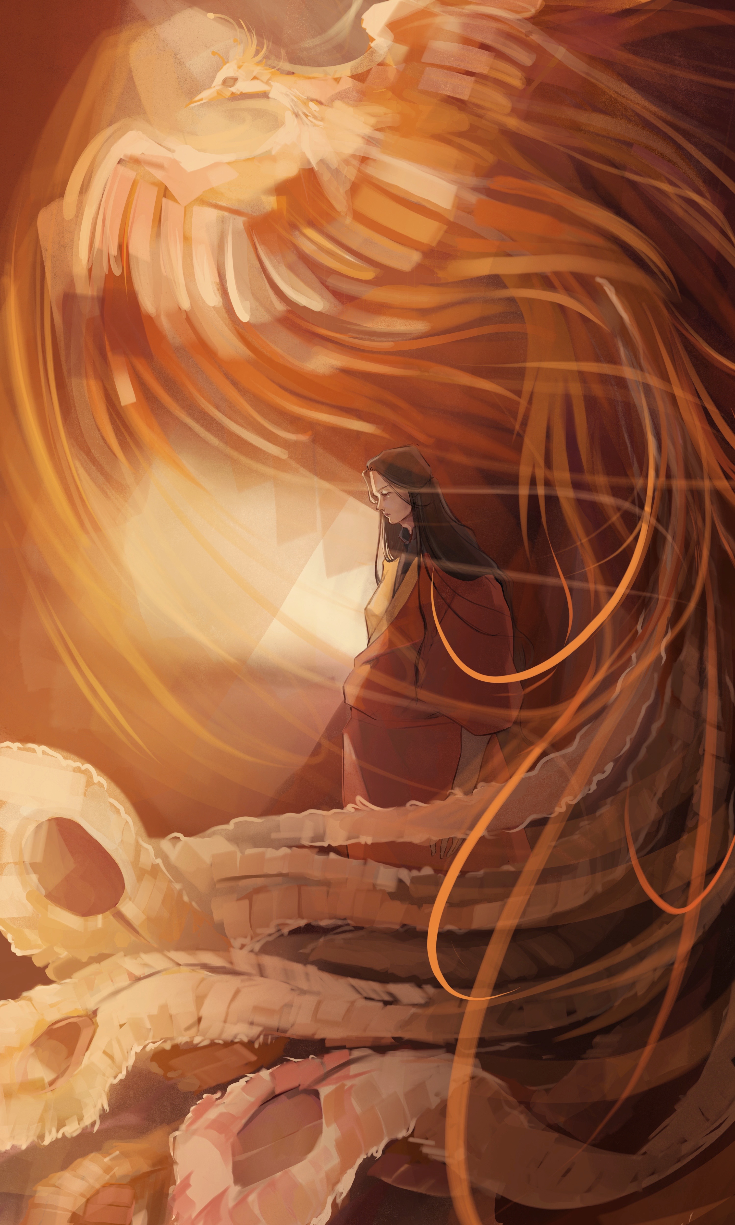
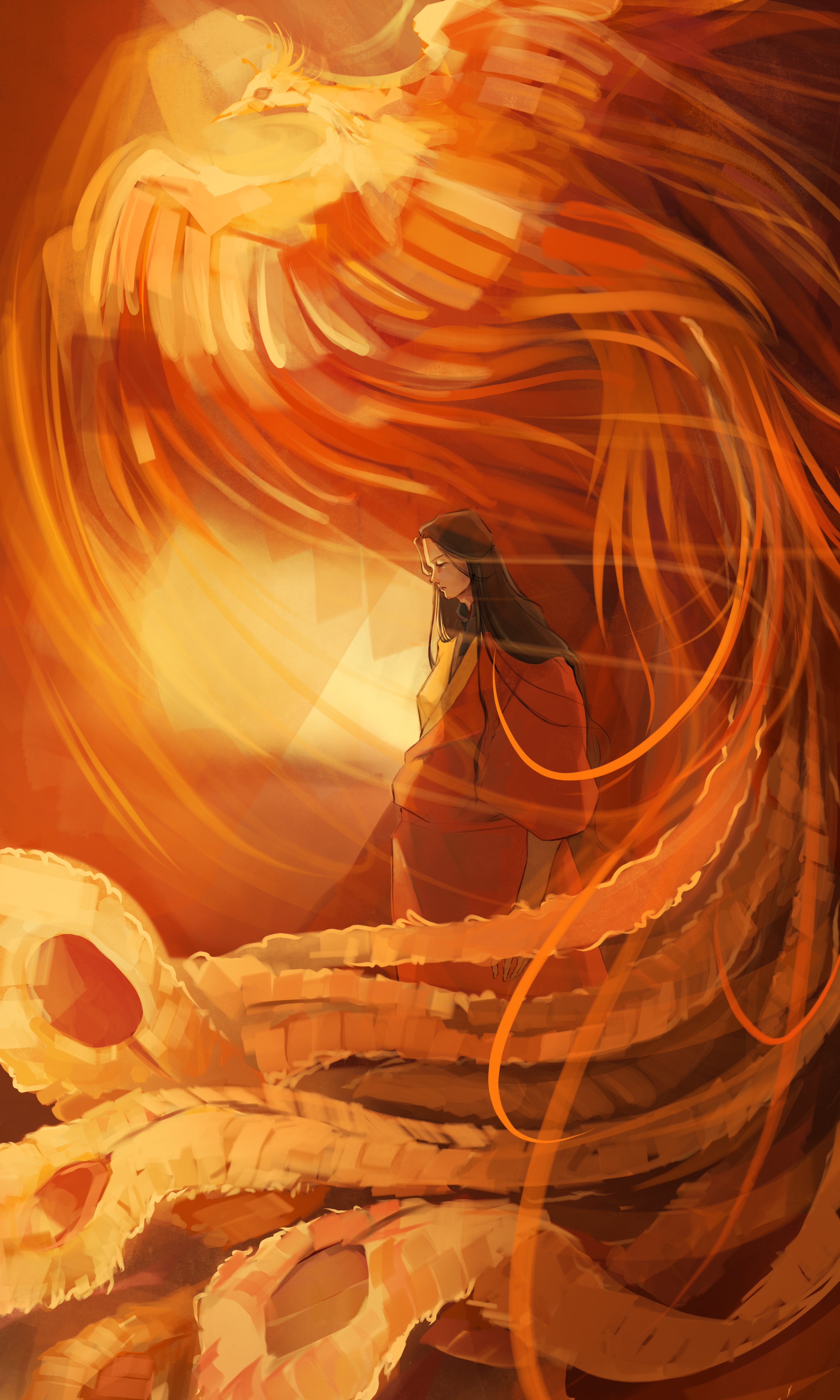
So I have a bunch of different color versions of one drawing and I can't choose which is the best. hexbears please give me your opinions.
Show
Show

Show
Show

Show
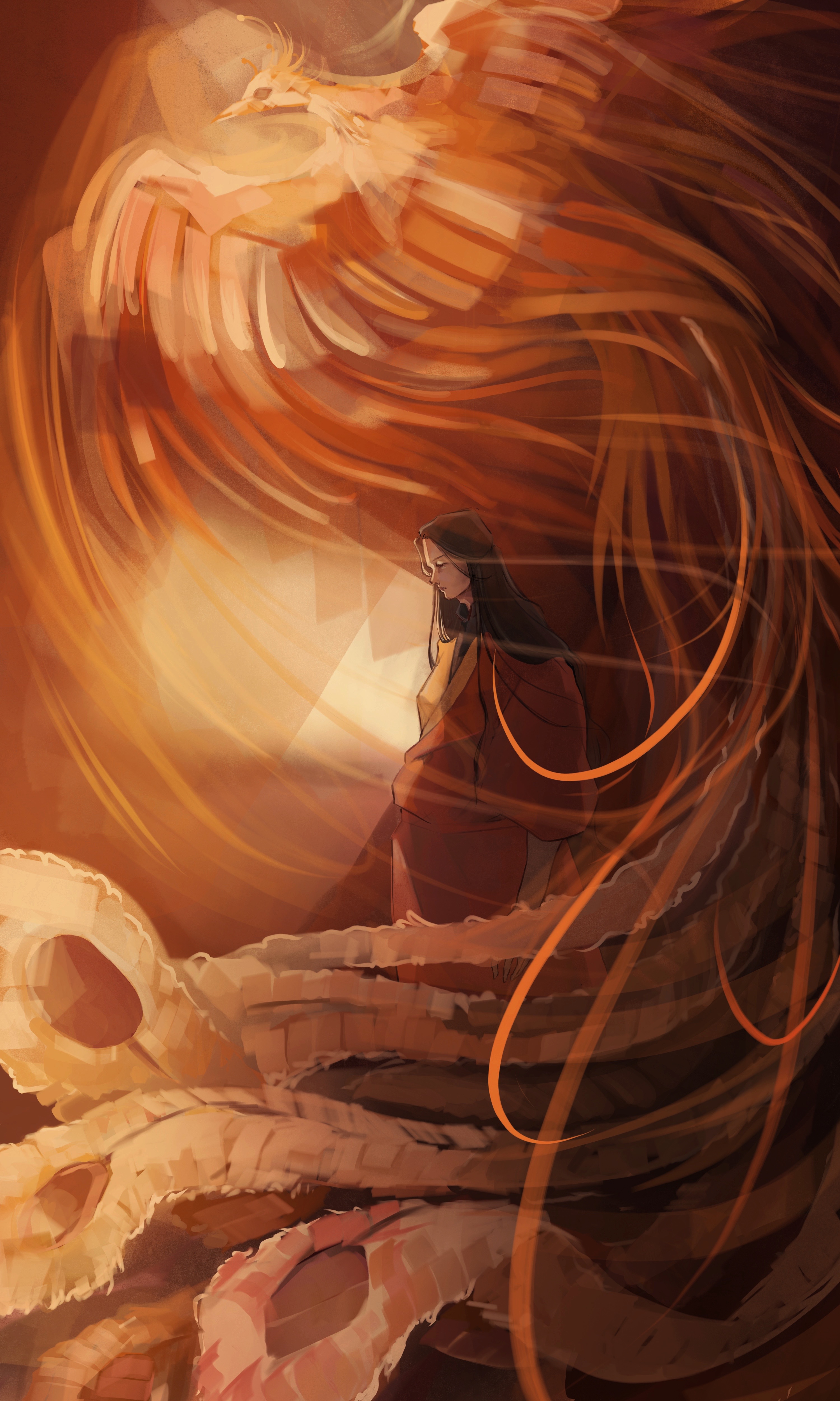
[IDs: 5 different color versions of one drawing. The drawing shows a young man with long hair, wearing an orange and yellow hanfu; and a Chinese phoenix swirling up besides him. /end ID]
Personal Opinion:
If you have the time/energy, it might help to mix elements of 2 and 5. Some strategically placed shadows/desaturation would help the saturated parts glow even more and create depth.
I would choose 5 as well. The background light source also has more clear directionality by first illuminating the character and then the wisps on the phoenix’s. With the other opinions, the light source appears more diffuse and would probably not create such sharp shadows on the character.
But I do enjoy palette of the more saturated renderings of the phoenix, especially 2. Maybe take some of that vibrancy from the lighter portions of the phoenix’s wings in option 2 and apply it to option 5? Then you won’t have to articulate a competing light source on the character, though some thin rim lighting might look good anyway.