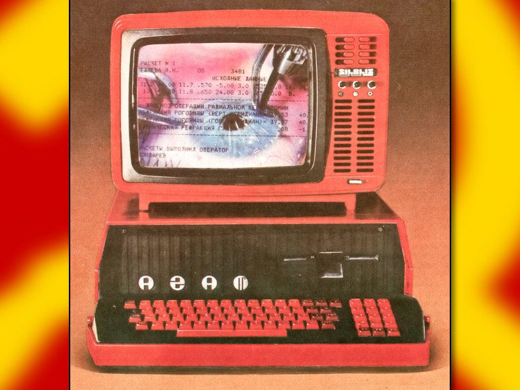
On tech forums like r/linux or hackernews, you'll frequently see posts by (presumably) old guys reminiscing about how great the user interface of their youth was.
"Oh how tasteful were these pixel art icons!"
"How utilitarian and consistent were the 3D effects!"
"How very intuitive are these menus!"
"It's all gone downhill since $PRODUCT. It's all flat and empty and useless now!"
Bollocks. These user interfaces sucked. The menus were a mess, because trying to shove 50 random items into 6 hierarchical categories, two of which are preordained to be "File" and "Edit", cannot be done in any way that isn't arbitrary and confusing. Thus you looked through all the little menus with your terrible mouse hoping to find something that sounded like it might be what you need, trying not to make a sudden move that made the submenu disappear.
Under the menu bar were between 30 and 200 tiny pixel art icons. They were just as incomprehensible as today's minimalist ones, only there were more of them and most of them looked like ass.
Oh and so many popup windows. Everything you did created a popup window. Why does the settings popup only use one third of the screen while having three tabs? Why can I see my document underneath it, half-obscured, but I can't actually click on anything there? Why do half the operations create an "OK" popup for me to click on?
Nothing about this was "functional" and yet it also looked grey and cramped and ugly. Like it was designed by C++ programmers (who by their choice of programming language have already proven that their opinion cannot be trusted, especially not in matters involving good taste), which of course it was.
Fucking brain worms, all of them.


deleted by creator
you can tell zero product designers live in studio apartments
I have an RGB graphics card poking its lights out of the tiny vents on my lenovo desktop case from 2010 now lmao
I didn't know it was RGB and I don't know how to turn them off :gigachad-hd:
I just paint over every bullshit indicator LED on everything I own with black nail polish. I despise how product designers now insist on putting super bright blue LEDs on everything. I do not need the humidifier or toothbrush two rooms away to illuminate my bedroom brightly enough to read a book and blue is the worst colour for brain-fucking a sleep schedule. I used to have crippling insomnia but now that I have covered up all the unnecessary LEDs in my home, I now sleep perfectly.
My electric blanket's display is one of those blue LED lights. Luckily it only turns on for about 10 seconds when you press buttons but it's bizarre to put a bright blue light on a product you're supposed to use when you sleep.
Are you actually supposed to use that when you sleep? Isn't there a warning telling you specifically not to use it when you're asleep?
I guess you're not supposed to. This one has a timer that I set to one hour though.