So, after the success of my thread praising FF1 NES's pixel art, I decided I'll transfer some stuff Ive been doing in a discord reviewing Final Fantasy (for a start) character designs and (for the games with pixel art) pixel art here. I've been going sorta one by one. And I started with Black mage so I'll do so again here. This is kind of annoying to do because it involves a lot of image uploading and the rate limiting kinda makes that process slow and you cant post externally hosted images so you cant just direct link the images either. Bit of an annoyance.
I really think Final Fantasy NES hit it out of the park art direction wise right out the gate, in many ways, and the original Black Mage is probably one of the highlights. Such a simple but iconic design. I like to joke that character design peaked there, and that we haven't exceeded NES black mage since. I question how much I am joking. Like here's this lil guy. This lil pogchamp. He has on a hat. And a blue robe. Is his face black because you can't see it or is it magical in nature? Who knows. Looks cool though. I made a thread about the Black Mage here on hexbear before actually lol, and someone did mention that he wasn't the first time that the black face with yellow eyes design was used for someone. The first time it was done MAY have been the Conductor from Toki no Wa? also Orko from Masters of the Universe predates the Black Mage.
Informationally I will mention that the Black Mage is one of the six classes you can pick for your four member party. The party members in FF1 dont have personalities or storylines other than whichever four your pick (and you can pick multiple of the same one) are the "Light Warriors" of prophecy. And they have orbs. Alright lets talk about the individual sprites though.
In the image on the first line, you have the Black Mage's appearance in the original NES version, the updated version from the Wonderswan/Playstation 1/Gameboy Advanced (Dawn of Souls) versions of the game that all look basically the same. That sprite that you see there is ripped from the GBA though. Then you have the PSP remastered version after that, these versions were also used for the original Mobile versions that are now deslisted. And then finally the version from the Pixel Remaster.
The second line are from the same games in order, but are the upgraded "Black Wizard" class that you get from a semi-optional midgame quest where you get Bahamut a rat's tail. The Black Wizard basically just gets an upgraded magic pool, access to spells that the base class can't get. Lets talk about the individual sprites shall we?
Original NES Final Fantasy


So yeah, I basically already talked about this but this is the original iconic Black Mage design that is so memorable and iconic. Its a simple sprite. Unlike the monster sprites for this game, the battle sprites and especially the overworld sprites you see here are fairly simple. which makes sense for the hardware. There is shading on the hat though! Which is quite nice. But despite its simplistic design its so iconic. The pointy hate, the blue robe, and the black face with yellow eyes. Perfection. I'm rating it a perfect 10/10 because you just don't get better than this. On discord I gave him a 9.5/10 but I change my mind. He's perfect.


So here's the black Wizard from NES and I hate him!!! I realize that they didn't know what they had with the iconic original design and decided to do an upgrade that took the hat off and showed his face and hair. (And gave him some... uh... Boomerangs??? Oh no they're apparently supposed to be shoulder pads.). But its just... not iconic or interesting anymore. Its not bad either, just it has nothing that grabs you. Its just a tall guy in a blue robe with weird looking shoulder pads and somewhat fancy hair. Its a totally middle of the road 5/10 and I shake my stick at it.
Its not different enough to matter but here for the record is the MSX sprite:


GBA Dawn of Souls
Since the Dawn of Souls for GBA version is the specific one I'm reviewing here, I'll leave aside that the upgrade to this basic look happened earlier and looked basically the same.
Just quickly, here are the sprites from the WSC


This lil cute art is from the V-Jump guide to the Wonderswan version.
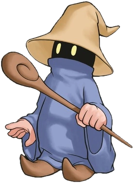
This art was made for the Dawn of Souls version and I really love it. It really, truly exemplifies my boy. Love the pointy shoes you dont really get to see emphasized in any of the sprites. And the rod. We see he has actual hands! And the way the face looks in a more full size image is nice. The hat is a little bit off looking but otherwise I like it.


So Square knew what they had when they updated the black mage's sprite for future versions and basically did not change it at all <3 And I'm happy for that. This is a good looking sprite and I do quiet like these game's style. Its not as simple and iconic as the original obviously, but its a good update to that. The shading and colors on the hat look very nice. It pops. And the shading and colors on the robe are nice as well. Since its basically just a good looking update to an already iconic design, I really can't give it anything but a 9/10 because anything else feels weird. Maybe for sentimental reasons than actual quality reasons, but I cant put it on the same level as the original.


So after the NES version they decided to make the Black Wizard actually look like a direct upgrade to the Black Mage and keep the same basic iconic appearance with the shadowy face. Its actually quite a nice design. Like, it looks snappy. The hat isn't my favorite. I just dont like the green on the band on it. It messes up the whole color system there. The robe becoming like a jacket though, I like that part. The colors remain looking nice, adding some gold fringes to the blue. The clothes that appear to be under the robe are opk, you cant see that much of them but they appear to be green striped pants. The gold color continues to work well and the green works better here than it does on the hat but its still not great. I give this design a solid 7.5/10 maybe a bit higher but I'm I'm using a .5 scale.
PSP Version


So, I've never been overwhelmingly a fan of how the PSP/Mobile version of the game looks. Generally I prefer the previous version, the one I associate with the GBA even though it started with the Wonderswan. Some sprites do look better on the PSP though. This one is a wash though, neither looks better or worse to me. Just different styles. I do like the hat here. More of a simple looking brown than more bold colors like before, but it works. The hands and face look right, though the eyes on the face may be a bit dull for me. The robe looks really nice. There's a nice quality to the way its shaped. Sicne I said its a wash with the GBA version, I'll call it a 9/10 again.


Now this sprite I hate. There really is only one good Black Wizard version and its the GBA one (we'll get to you and what you DID Pixel Remaster). The whole upper part looks fine admittedly. He's like a chubby little guy which is sweet. The hat and the face are fine. The hat is basically the same as the base Black Mage except I think the brown on the stripe is a bit bolder? But god, I hate what they did with the body. The scarf/cape thing for what the robe transitions into is a decent idea but doesn't work that well. I like the jacket idea better. The part that really sucks is the balloon pants though. It just looks fucking silly. Like some sort of circus tent, or bouncy ball. The colors are bad there too. Mostly for the balloon pants issue I have to give it no more than a 4/10
Pixel Remaster
Briefly, I should mention that the Pixel Remaster is currently considered sort of the definitive version of the game by Square, and is available on most platforms. It noteably replaced previous versions on Steam. This is a bit annoying because sometimes it replaced versions that had bonus content. Like the Dawn of Souls versions of I and II have bonus dungeons that the Pixel Remaster dont have. But I and II were never on Steam before the Pixel Remaster so thats not so bad. Plus I can emulate the GBA or PSP versions and get that bonus content. (That did not end up being briefly).


The Pixel Remaster visual style is more miss than hit for me a lot of the time? And for Black Mage, its kind of a miss. Even though its just a slightly visually different version of the original sprite, I dont like how it looks that much. Its... shaped wrong. Its trying to be faithful to the original but it just... its weird. The left side shoulder bump looks different in the upgraded style in a bad way. The gradiant on the hat looks bad. The robes though look quiet nice. Very nice blue they chose. I'll say 7/10 boosted by the robe.


FUCK PIXEL REMASTER FOR THIS BULLSHIT. I know Pixel Remaster really wanted to be faithful to the original games, but they made concessions to that vision in some areas and this should have been one of them. There was NO reason to be faithful to the original, boring and stupid Black Wizard look instead of doing like a taller black mage (without the visual detailing of the GBA and PSP versions). Just make the black mage tall! The thing is, its actually a perfectly nice looking sprite, I just dont want them to do what they did with it. Everything visually and color wise is fine. The robe color continues to be nice. The head looks good. Shoulder pads still look weird though lol. Also what did they do with the shaved looking sides of the head from the original? Its got like, gold spots instead of skin. Is it some sort of headress? It looks odd. I'll give it a 6/10 because its a perfectly nice looking sprite but they should NOT have gone that direction with it.
Spinoffs
So Black Mage reapers in later Final Fantasy games frequently, but usually its not specifically the FF1 Black Mage. So I can't really list most of them here. He exists as a Triple Triad card in the Final Fantasy Portal App
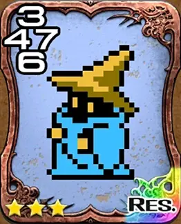
And also as a tutor in the in-game manuals in Dissida Final Fantasy 2008.
While Final Fantasy fandom doesn't include these repeat appearances as being specifically FF1 Black mage, I would like to mention some. First of all, Black Mage's sprite is the exact same in Final Fantasy III, but we'll discuss that more when we cover that game. There's also a generic black mage as an accompanying party member in Final Fantasy IV: The After years, but it has a totally different sprite in some games. Noticeably though, its sprite in the Wii version of the game is the exact same as the one later used in the Pixel Remaster, so the Pixel Remaster sprite is actually recycled from that. I think anyway.
A generic black mage appears in the tutorial for Triple Triad in Final Fantasy VIII
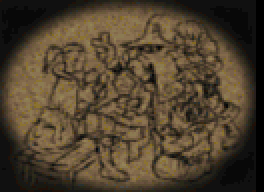
It appears as a job in every Final Fantasy with a job system, but again we'll cover those when we get to those games. A new character inspired by the FF1 Black Mage exists as a free unit in Final Fantasy Brave Exvius, but I'll cover him separately too.
The only spinoff appearance that's not explicitly the same as the FF1 Black Mage that I do feel like covering here is the one in Final Fantasy Record Keeper (same sprite originally used in All the Bravest, but fuck that game!)

Its a different piece of art than the GBA version dspite being quite similar. Its... not that good though as much as I love Record Keeper sprites usually. Its eye is greenish-blue for some reason. Also the shading on the robe of the sprite is all wrong. The hat looks ok though? I'll neglect to give it a rating. The Record Keeper Black Mages are one of many generic units you can unlock in the game that... don't have much use because the units that are actual characters are much more useful and fairly easily obtained. And they don't have strong weapons (the weapons are what you get from the gacha in the game).


Here's a spinoff I found out about in this research. These are from Pictologica Final Fantasy. I'm not sure what it is! But the sprites in the game look different and there's a female version! I actually quite like the art style here. Its smooth, the hate looks right, the robe looks right, the face looks pretty much right. I'll still neglect to rate it but, its nice looking. The female version... is trying to hard. Why the green hat? It looks dumb. I do like how the brown hair looks. But noteably, the original black mage is kind of inherently androgynous so was a "female version" actually necessary"
I almost covered the Black Mages from Final Fantasy Airbone Brigade here, but then I realized they're more based on the generic Black Mage NPCs from Final Fantasy IX, so I'll leave those for now. I'm alos leaving alone the BLack Mage from Mario Hoops and Mario Sports Mix because he's sort of his own thing.
One last thing I'll post due to obsessive compulsion even though it'll make the rate limit issues take longer, is these two screenshots of Black Mage references in Legend of Mana. Since they are based directly on the FF1 design.
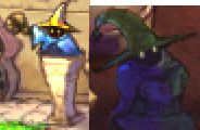
My Discord posts also included fanart but thats too much image uploading here so I will not do so lol. Would take hours with the rate limit.
Honestly we'll have to see if I do another of these just because the rate limit issue and I'm not sure if theres a way to get around it. IF I could just link to the images that all come from Fandom then that'd be fine and easy but externally hosted image hits so.
I don't really post much in the discord (or here for that matter) but I liked these posts of yours
Black Mage is an example of peak character design
If by classic you mean 2d I'd say VI or IV are the best.
IX is my favortite overall and is old af by now lmao but not pixelart.
