
- cross-posted to:
- genzedong@lemmygrad.ml
cross-posted from: https://lemmygrad.ml/post/5770703
My own article as a companion to the new ProleWiki homepage we are releasing very very soon, explaining how we started from nothing and got the final full page.
You must log in or register to comment.
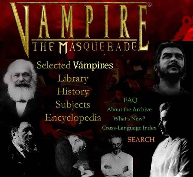
the virgin ProleWiki redesign, the chad Marxists.org original 90s drip
vtmb if it was based
also, it should be marxquerade
Show
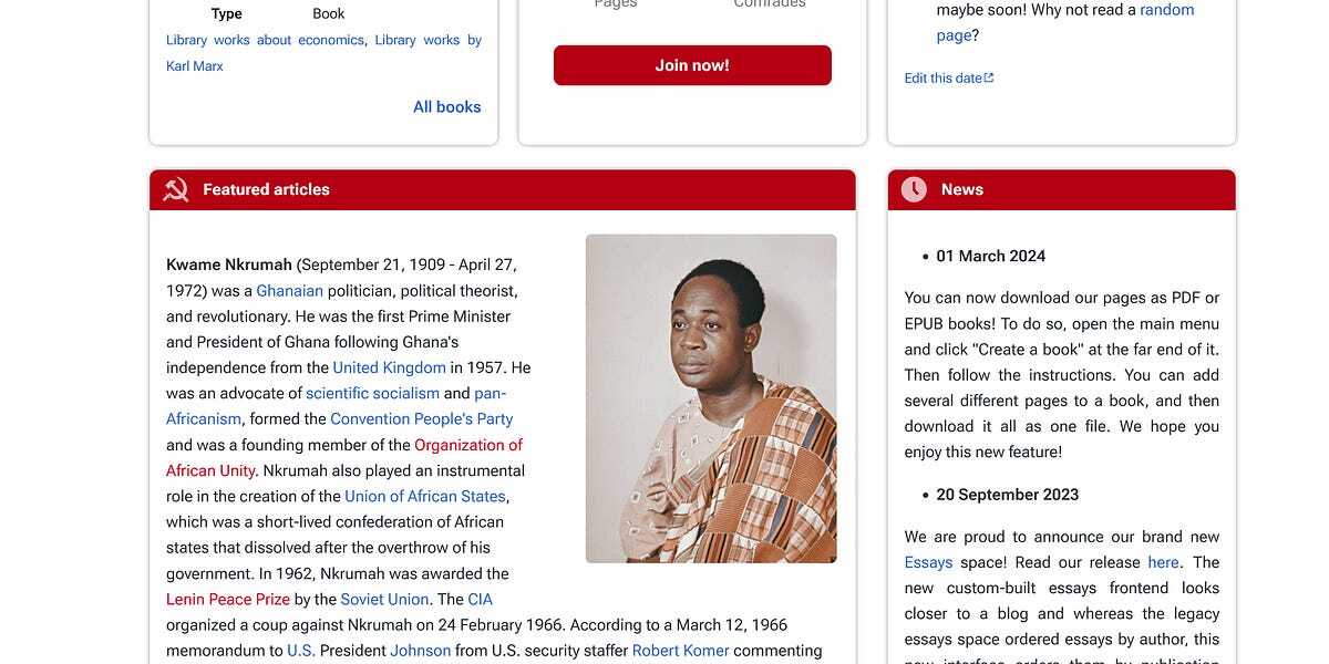
Ideas don’t come out of nowhere, and for the header to this mockup, we took heavy inspiration from the Star Citizen wiki, who also provide the theme we use on ProleWiki.
no one tell @UlyssesT@hexbear.net
Hahaha the game is a scam but the wiki is a work of art, though I find them to be better on visuals than coding, there's very little documentation for the theme and they rely heavily on css variables in a way that makes them very difficult to understand and modify.
Thanks for sharing! Much to my own surprise, I ended up reading the whole thing. Design has always seemed a little mystical to me as someone with almost zero aesthetic sense, so it was really helpful to have it broken down in such a straightforward and actionable way. Definitely something I will revisit next time I'm starting a project!
Also, the new design is a major step up in usability--I especially appreciate the prominent search bar and the improved information density/availability of information without scrolling. Aesthetically speaking, I think the replacement of the banner with just text and a logo makes the page a lot more elegant and also makes it so that the eyes are drawn more naturally to the actual content.
Thanks for reading! The original theme maker basically mastered the header, as they should since they made the theme. For example, you could always press the / key to bring up the search menu on any page with this theme, it's just that it wasn't advertised. Hence, like them, we put the shortcut in the new search bar.
I'm not 100% sold on the pillbox and I'm looking at ways to think of it differently; it works well on their wiki for various reasons, but I feel it's a bit out of place on our wiki and there's an information overload. Still, it allows us to compactly (as you pointed out) direct visitors to areas that we want them to look at, like our marxism portal, or areas of the website that we know they are often looking for. I notice now I didn't really talk about the pillbox in the article, I might go back in and edit that.