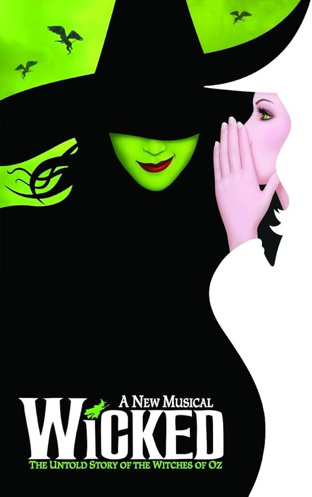
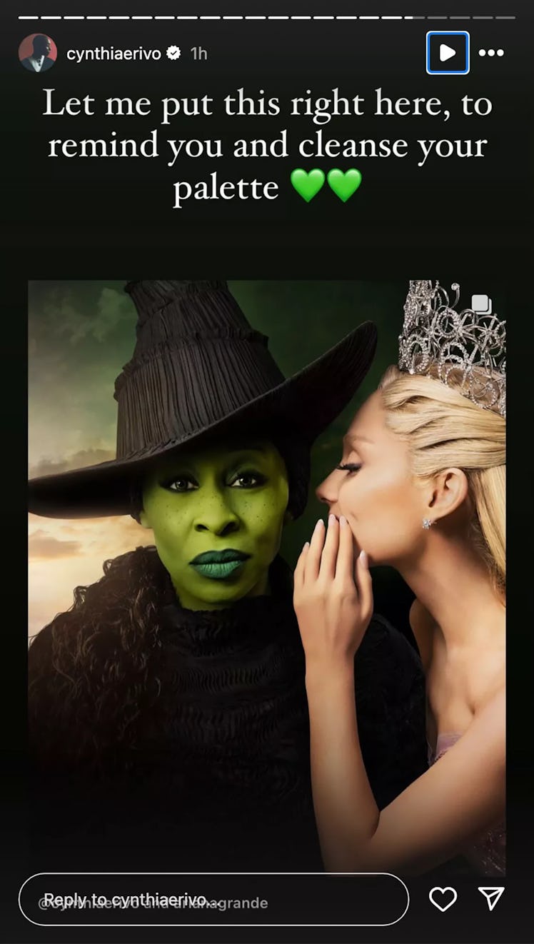
Fans customized the Wicked movie poster to more closely match the original Broadway poster.
Original Broadway Poster:

Movie poster:

Some fans, disappointed by the poster, altered it to be closer to the original, moving Grande’s hand and lowering the brim of Erivo’s hat to cover her eyes. The edits prompted Erivo to respond. “This is the wildest, most offensive thing I have seen
“None of this is funny. None of it is cute. It degrades me. It degrades us,” Erivo continued. “The original poster is an ILLUSTRATION. I am a real life human being, who chose to look right down the barrel of the camera to you, the viewer… because, without words we communicate with our eyes.”
So, this seems like a completely reasonable reaction to fans making fan content.
If it was her decision that her full face should be on display, the backlash should be evidence enough that someone else gets paid to make those decisions, not her.
The original looks boring. She has absolutely no emotions on her face. There's no mystique, no 'wickedness'. Even the composition looks like something a high schooler in Photoshop class would make.
The edit isn't perfect either. But at least it pays homage to the original in more than just image. It adds that mystique back, and makes her look more menacing.
What it truly boils down to is ego. Although the edit is better, and so many people agree on it, it doesn't show her full face. And she can't let that go.
Guaranteed this whole thing came up before that it didn't match the style. She showed her cards and now makes it sound like she was the one who pushed against matching the original. Now that the fans see it and dislike it (probably like they warned that fans would), she's mad about it. It really sounds like she pushed for this design so it wouldn't hide her face and now she's furious that fans reacted in the exact way that was predicted.
The ego and vanity is astounding. And the movie poster sucks because she's looking straight at the camera.
If that’s the most offensive thing they have seen they live a charmed life.
Yeah unless there's any black women who want to educate us on the reality that black women have been historically had their eyes erased or something, this is just fucking weird.
They didn't even like try to edit her to make her "more white" or something, like in terms of her facial features.
Sometimes people are seriously just oversensitive and looking for enemies where there are none.
As a white person I'm definitely not the one to say if that's bad or not - but yeah that would be 100% a teaching moment - because I am not aware of anything like that. Instead of slamming down the hammer of "most offensive thing I've ever seen" for what I can only see as a fan poster that's mimicing one that already exists she could have said something like "I understand why they did this, but here is why I disagree with it". Personally as a fan of wicked, I was disappointed by the poster. Not enough to make my own, but the original poster was iconic to me.
Agreed. And the biggest issue for me with the official poster is the lack of vibrancy. It's the drab "serious adult reboot" colours for some reason.
Makes me worried they completely missed the mark for what Wicked as a show was and Hollywood'ed it all up
What an utterly ridiculous and inconsequential thing to get upset about. Someone should tell her to re-read what she just wrote and think about how stupid it sounds.
Look, I'm all about listening to a woman of color explain how something that might seem innocuous to a white man like me might actually be harmful. I'm willing to accept that there are things I don't fully understand and I'm willing to take a different perspective if pressed.
But I can't wrap my head around this one. Elphaba is a fictional character. The movie poster is almost the same as the Broadway playbill. Theatre nerds with photoshop adjusted it as a homage, and understandably so. Hiding beneath the the rim of your hat with a smirk on your face has a much different feel than staring deadpan at the camera. Wicked fans are just expressing their excitement about this movie...
This argument that "covering my eyes erases me and silences my nonverbal communication" just doesn't check out. It's clear why people made that specific adjustment, and to suggest that it was a deliberate attack against the actress is just grasping at straws. This isn't a story about the woman Cynthia Erivo, this is a story about the character Elphaba Thropp, The Wicked Witch of the West. She isn't the first to play Elphaba, and she won't be the last. If she's mad that people see the character she plays and not her, she needs to reconsider her philosophy towards acting, because that kinda the whole point...
Without words we communicate with our eyes
True, but this actress ain't doing that. She's completely dissociated in the pic, her expression so blank and emotionless, screaming that she's dead inside. While a dissociated character could make a good villain, it's not hard to see that the character in the poster for the musical isn't a dissociated villian who is unaware of her cruelty but someone who is fully conscious of and revels in it. It's only natural that people who are fans of the original work notice just how out of character this is and try to fix it.
Don't like it? Stop making stupid remakes of ancient stuff and make something original for once! Maybe try putting some emotion into it!
But you know, that'd require Hollywood actually put in effort and they've probably forgotten how to do that by now. Seriously, is anyone watching the new shit that they fart out over there these days? Most everyone I know either rewatches old shit or watches anime. Hey, maybe we'll see the rise of Bollywood over the next couple decades, who knows?
https://www.sbs.com.au/voices/article/headless-women-project-highlights-gross-sexism-in-movie-posters/2bhgrghmc
Compare movie posters of women whose eyes or even whole heads you can't see or that are reduced to legs vs. movie posters of male actors to whom this is rarely done and it is clear what is happening.
Top this with the problems people of color face and that the new poster takes away her facial look, the look of a person of color and replaces everything that reminds of her with a bland face that could be anyone and I understand her anger.She could have explained the issue instead of lashing out, because so many of her fans (and people in ths thread) don't understand the problem and education is necessary and more helpful for everyone.
That article, which does highlight a valid criticism of society and Hollywood, doesn't really apply to this scenario. The fan edit isn't about sexing up the characters. The edit is doing a more effective job of recreating the original poster than the movie studio did.
I don't fault the actors or even the studio for wanting to feature their high paid actors on the movie poster but by trying to recreate the original but failing to capture the mood, of course fans are going to want to put their spin on it. There is probably even a middle ground that could have been struck to make her face mysterious but still mostly visible.
Is it rude and offensive when fans edit the Lord of the Rings films to better reflect the original story as told in the books?
In the end, I'm pretty sure this whole thing is a PR stunt to stir up word of mouth. Which of course is working because we all like to argue.
I don’t fault the actors or even the studio for wanting to feature their high paid actors on the movie poster
But already the original failed to do that. Imagine a movie like that featuring high paid male actors in a way that their faces are minimalized to a point they are unrecognizable (just check their posters and how prominent their faces stare at you). No one would do that. Just because people are used to the old poster does not make it good. The original is a failure that did a disservice to the women on it, just one we know and are nostalgic for. I do not think this fan poster was done in malice but because it is still not recognized wildly as a problem and we need to get the message out: Show the women's faces as much as you show the men's faces.
I don't think this is a PR stunt, I think it is honest feelings that come up for a reason.
Imagine finally as a person of color having made it to a point in your career that YOU are the center piece of a movie poster of a highly anticipated movie and just with a finger snip someone erases that because they love an old poster that erased other women's faces at a time where no one bat an eye about it.
Again, I understand nostalgia. I am 58 y.o. and I had to let go a myriad of things that were just fine in my youth and learn why they definitely were bad back then and are now. Let that old poster die. It is not good, its mood is erasing women, which is wicked, I give it that.


