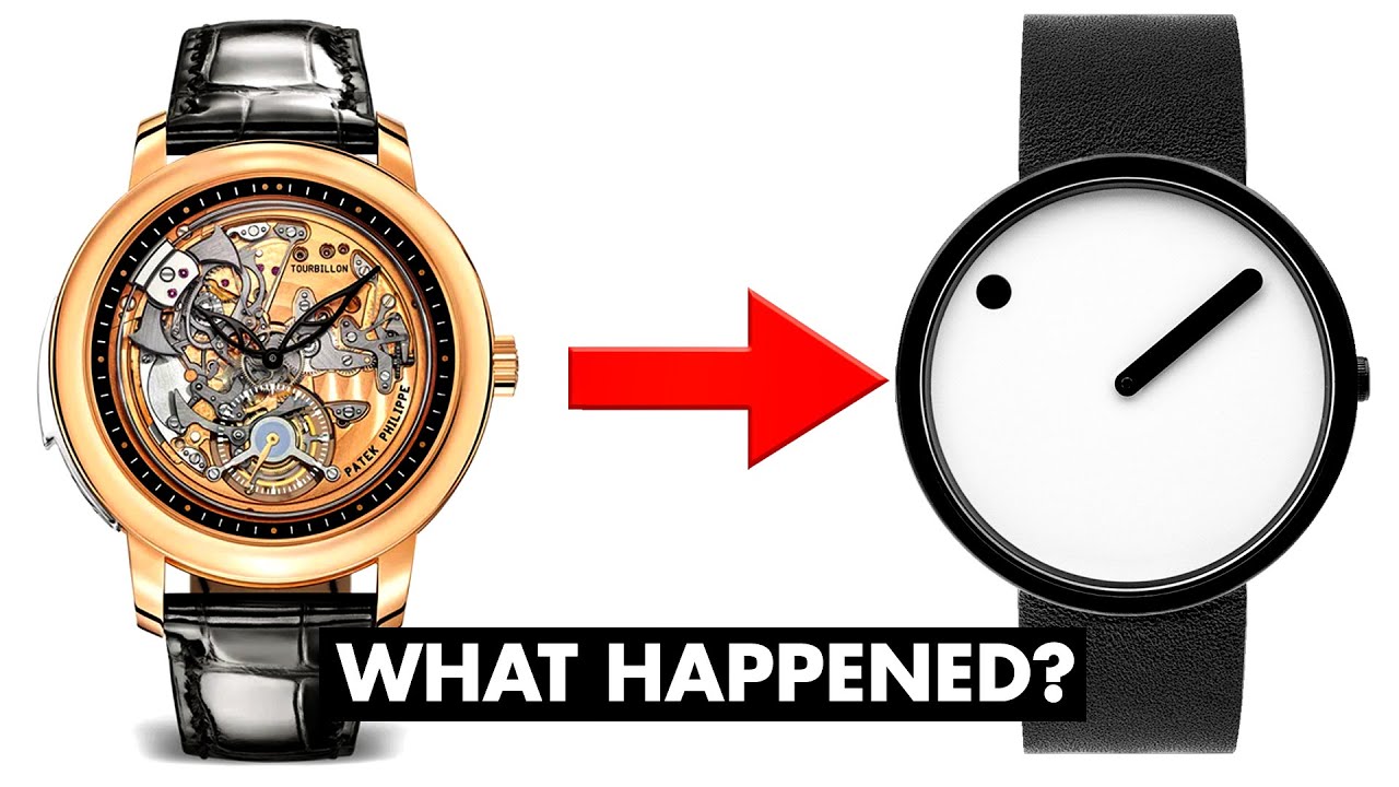
Minimalism for its own sake strips away useful features and makes things so bleak, bland, and pretentious. A lot like the Steve Jobs cult that really launched the fad.
We should just ask a billion people to rate millions of products on a scale of 1-10 and then train an AI to rate how good the design of a product is. Then we'll put it in a giant statue and call it the God of Design. Then if you want to know if a design is good or not you have to prostrate yourself before the statue in a grand ceremony.
*removed externally hosted image*
"Your shoe design is mid" the God of Design ordained.
Very insightful look into the mechanisms of minimalist design and their shortcomings.
Minimalism as a design trend dates back to the beginning of the last century, but you might have noticed that companies have extensively used minimalist principles in their product design in the past few years. Apple is especially known for this, but you see it everywhere nowadays. Cars, fridges, TVs... they are all stripped of any extravagant design features: fewer buttons, no ornaments, single colors, and so on. Even if you are not designer, you have probably noticed that in some way.


