
Hey, nerds. Still hard at work on my Zelda clone. Based on feedback from many different people, I've settled on a tentative title of Guardian Cry. I hope to have a playable demo with the Phoenix Temple out by the end of the year, which will require me to do a lot in a short timeframe, but so far I'm on track to pull it off.
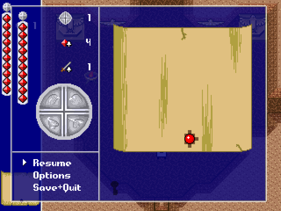
The big silver emblem you see in the screenshot is how the player will track their progress through the game. On its surface are reliefs of the four Guardians - the Minotaur, the Gryphon, the Phoenix, and the Unicorn. Each time you defeat one of the Guardians and gain its ability, that Guardian's eye glows ruby on the emblem. In the pic none of the eyes are glowing, even though the player would have beaten the Minotaur and the Gryphon by the time they're in the Phoenix Temple - I wanted to show the emblem without any modifications.
UI suggestion: hide the in-game UI (the component housing the health bar on the left side of this screenshot underneath the pause menu) when a player brings up the pause menu. As far as I can tell all of that info is duplicated on the pause screen component so it shouldn't lessen functionality. If that would mess up the aspect ratio of the main screen consider making the pause menu fullscreen.
Also because it's just a screenshot I can't tell what the speed is going from live->paused->live, but I love when games let that be an incredibly quick transition and get irritated over the life of a game (especially on replays) for games that have long pause screen transitions.
That said great work thanks for the update and looking forward to playing it!
UI suggestion: hide the in-game UI (the component housing the health bar on the left side of this screenshot underneath the pause menu) when a player brings up the pause menu. As far as I can tell all of that info is duplicated on the pause screen component so it shouldn't lessen functionality. If that would mess up the aspect ratio of the main screen consider making the pause menu fullscreen.
Could also add a background to it that covers the main UI. Keeping the windowed look without having the noise behind it.
Alternatively the sidebar could be removed entirely and its elements replaced with floating elements. But it might be an aesthetic choice to go with the old bar style rather than the newer floating ways.
UI suggestion: hide the in-game UI (the component housing the health bar on the left side of this screenshot underneath the pause menu) when a player brings up the pause menu. As far as I can tell all of that info is duplicated on the pause screen component so it shouldn't lessen functionality. If that would mess up the aspect ratio of the main screen consider making the pause menu fullscreen.
Yeah, unfortunately, that would mess up the aspect ratio. Rooms are sized based on the screen space available with the UI bar on the left, so if I removed it I would have to enlarge all of the rooms.
Also because it's just a screenshot I can't tell what the speed is going from live->paused->live, but I love when games let that be an incredibly quick transition and get irritated over the life of a game (especially on replays) for games that have long pause screen transitions.
Hopefully you'll be happy to know that the pause menu comes up instantly when the button is pressed.
That said great work thanks for the update and looking forward to playing it!
Thanks! I'll be sure to post the demo here on Hexbear once it's done.
This is dope! I really respect that you're showing off such an early prototype.


