
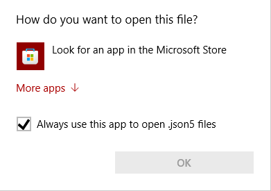
It's completely inconsistent with traditional Windows design language and there's no "Cancel" button or an X in the corner to click on so you can't cancel out of it with your mouse and have to reach for Esc on your keyboard
It also tries to funnel you into a shitty Microsoft service
I've started using Windows with Windows 98, and they're basically three UIs that clash with each other:
The OG UI design that started with Windows 95 and continued up to Windows 2000 like this: https://stealthsettings.com/wp-content/uploads/2016/03/change_ip_v4_address.jpg
Stuff added in from Windows XP to Windows 7 like this: https://blog.usro.net/wp-content/uploads/2015/11/windows-10-classic-control-panel-1024x607.jpg
That Metro-phone crap that started from Windows 8: https://www.windowslatest.com/wp-content/uploads/2018/01/Windows-Update.png
Honestly, people don't talk enough about how the XP-Vista-7 stuff clash with the 95-98-2000 stuff, but it's there. Microsoft fucked up again by layering yet another UI design on top of the first two, and it just looks like ass.