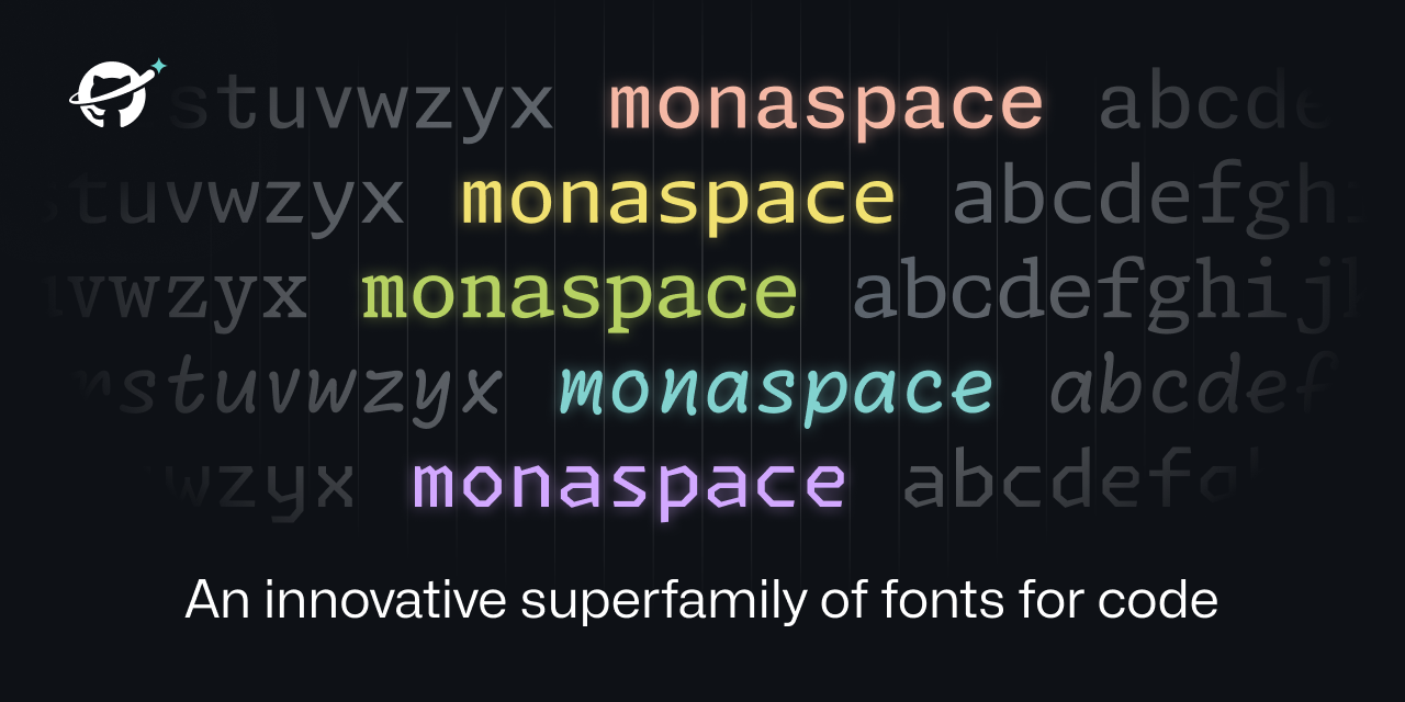
Technically, font healing is a neat idea. It fails for text that does not meat its requirements, i.e. two 'm' next to each other. Depending on the characters around them, this might create two different 'm'.
*removed externally hosted image*
This is unavoidable, of course. The only solution are proportional fonts. So font healing is a nice idea. It creates a more consistent spacing at the price of less consistent glyphs. Whether one likes this compromise, is a matter of taste. I personally lean towards consistent glyphs, but I did not try it for an extended period.
I've long preferred proportional fonts and positional tab stops like what you find in a WYSIWYG word processor. Got a tab position wrong? Drag it as appropriate or, if necessary, add a new one. In fact, during a period where I was doing far more writing than programming, in the days before code completion, I preferred my WYSIWYG word processor to my code editor. I had appropriate scripts and macros for cleaning up imported text files and to always save both native format and a text file with spaces in place of tabs. I also had different templates for different languages so that I could have custom processing for different languages. (It helps that a big part of that job was teaching people how to use word processors as far more than just electronic typewriters.)
Now, of course, the programmer's editor is an advanced tool tailored to the job, making it lunacy to even consider a word processor as code editor. Which doesn't mean that there aren't word processing concepts that might be valuable.
Nick Gravgaard has some good writing on the subject and links to a variety of resources, including to at least one proportional font designed for programming.
Interesting. Thanks for sharing. I started with WYSIWYG and did not like editing with proportional fonts. Things do not align, the cursor jumps around and movements have variable distances. But I much prefer looking at beautifully typesetted proportional font (e.g. with LaTeX). While I think, monospaced font are nice for editing, they are okayish to look at.
Thanks for the link. I will look into it and maybe try proportional for coding once more. Another idea I really like are almost proportional fonts. Read about these fonts a few month ago. So far I haven't tried them.
I'm just getting back into programming as a retirement hobby after leaving the field due to burnout 15 years ago. That means I'm only just starting to figure out editors and such.
I don't know of any code editors that use tab stops the way a word processor does. A word processor uses tab stops specifically for alignment at defined positions rather than tab characters equivalent to specific number of spaces (or tab key to insert specific number of spaces). Without the ability to set positional tab stops, I don't know that proportional fonts will be all that great for most people.
I took a look at your link to almost proportional fonts. Thanks. I don't know how I missed that, given that iA Writer is one of the editors I've been playing with for general purpose writing. (I've become disillusioned with the state of modern word processors.)
I'm not sure I'd consider that "failing". At first glance, I don't mind the distinct "m" glyphs being juxtaposed. But perhaps I'd find it annoying after a while.
Maybe 'failing' is too strong. What I mean is that in situations like the one I showed, texture healing cannot solve the problem of uneven texture. Not that they claimed it does. It just eases the problem. I like to know the trade-offs. When does it provide an improvement and when not? What tensions does that create?
From a users point of view, I do not know if it 'fails' or not. I totally agree with you. Maybe the I would find to distinct 'm' glyphs annoying, maybe not. And example emphasizes the 'problem'. Maybe, I woukd even notice while coding or writing. To know that, I need to try. I just like to know the trade-offs in advance.
When reading the announcement post, I was indeed hoping they'd include an example word with two "m"s in a row, so I was glad to see the example here. I don't mind it, but it does feel almost dishonest to exclude that case from their post.
Yeah, I am always happy if a project not only mentions where it shines but also where it does not. But it is common practice not to do so. Same in academic publishing. Everybody is focused on selling oneself, it seems.