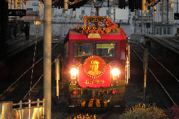
o to be a skelly sitting on the sleepers of the ribcage railway
Train infrastructure is too expensive, let’s half the number of rails.
Is the train made of flesh, or is he made of train?
He screams, for he does not know.
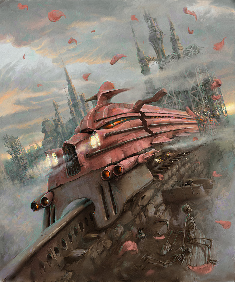
Nothing makes sense on a structural level, nothing is quite symmetrical, nothing adds up (eg the sky behind the cattle catcher, the open door on a moving train, and the steel structure), there's weird inconsistances where the AI forgets that it's drawing a monorail and it turns into 2 rails. I'm p sure it's AI.
This is just fantasy art by a person with
 "cool!" mindset and zero prior research
Not AI. It's an illustration by a Russian artist Andrew Ferez for the Stephen King series The Dark Tower.
https://www.cuded.com/illustrations-by-andrew-ferez/
https://darktower.fandom.com/wiki/Blaine_the_Mono
quite possibly. i reverse image searched this one to double check that it wasn't generated, because you're right, those are the kind of details you'd look out for, but it's a good reminder that artists have been struggling with perspective and fudging the details in their work long before stable diffusion made it cool
Did he not even sketch it out before painting?
It's like he spent a lot of time, 1 inch at a time, so none of the pieces quite fit when he gets to another part.
If it's not an error, is it a stylistic choice to give it a dream-like feeling to follow the weird rules the Dark Tower series uses?
To make the train seem more like a living creature, but one that's utterly alien to us?
It's like he spent a lot of time, 1 inch at a time, so none of the pieces quite fit when he gets to another part.
This seems reasonable. Looking at this other work of his it definitely has that sense individual elements individually rendered decently (probably sketched with a reference image) but slightly off when they come together.
Show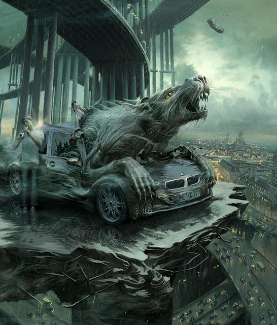
(The angle of the overpass compared to the broken platform, the rear tyres of the car at a different angle to the feet of the man looking like it's floating, the highway below passing under the bridge and just not continuing, the hood of the car extending beyond where the front windscreen would be based on where the rat's left arm is placed)
I'm not an artist so I feel a bit rich ripping into the work like this. He's definitely competent and far better than I'll ever be, but having been made more aware of these 'continuity/logic errors' prevalent in generated art does put me, for one, on the lookout to scrutinise human art at a level I wouldn't have previously. A decade ago I'd probably just go 'damn cool train' and be on my way.


