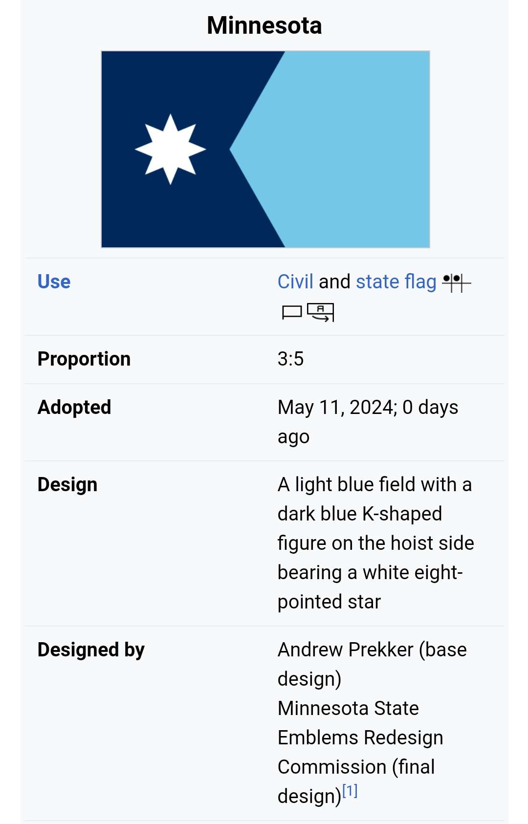
Yeah, making the right section a solid color completely throws off the balance of the flag, and you lose the symbolism of snow, forests, and water. Kinda baffling, but I guess that's the problem with design by committee--you end up with something just bland enough to pass a vote.
Still leagues better than the state emblem slapped on a blue background, so it's progress I suppose


The original proposal, for reference
Yeah, making the right section a solid color completely throws off the balance of the flag, and you lose the symbolism of snow, forests, and water. Kinda baffling, but I guess that's the problem with design by committee--you end up with something just bland enough to pass a vote.
Still leagues better than the state emblem slapped on a blue background, so it's progress I suppose