

its so lame
They should have gone the Ohio route and said "fuck you, you need to use an alpha channel"
Show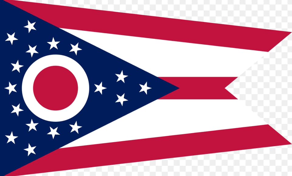
Still better than a seal on a bedsheet. But there's a trend with new flags that make them all look corporate.
Its the corporate Facebook blue for me. Totally ruined color because its on everything.
New Jersey has the seal on the bedsheet, IMO they should change it to this https://twitter.com/NJGov/status/1420098327509676033
The fact that he hates one of the best state flags because it has a singular “C” on it (never mind its clear visibility and simple geometric design) means I can’t take his opinions on flags seriously.
And he hates on South Carolina’s flag for no good reason.
Both of those got ranked under North Carolina, which has a big “NC”, two dates on it, and is otherwise just the same as the Texas flag.
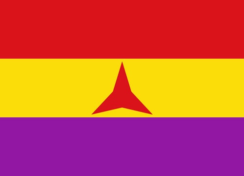
They had many decent (non meme) proposals. Even the proposal this is based on wasn’t horrible, although it wasn’t the best. But then they decided to remove the tricolor and just make it a completely plain background. Why?
The original proposal, for reference
Yeah, making the right section a solid color completely throws off the balance of the flag, and you lose the symbolism of snow, forests, and water. Kinda baffling, but I guess that's the problem with design by committee--you end up with something just bland enough to pass a vote.
Still leagues better than the state emblem slapped on a blue background, so it's progress I suppose
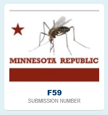
i believe the biggest problem the lack of contrast. leftist flags usually have colors that POP!
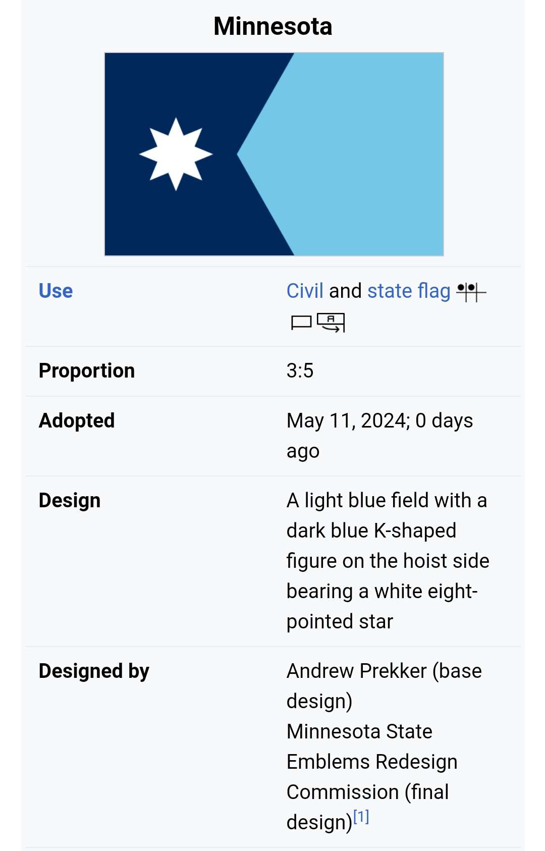
it also looks really arbitrary, but this has probably something to do with the fact that its minnesota.
The left side looks like a simplified map of the state, which is kinda fun.
idk I feel like when I very occasionally hear something from there it isn't terrible compared to the rest of them.
Minnesota is probably the best Midwestern state, which is horrifying considering it was a flashpoint for the 2020 BLM protests.
Every other city police dept does the evil shit that the MPD does, but sometimes we can all get together and burn a precinct over it to get some results
Had no idea it was a popular place lol, I don't live there but do often have to go there for various reasons and have never once had a good time. Minneapolis is hell and the northern parts of the state could be the set of the next Fallout game without making a single change
Did have some really good barbeque in a town there once though so it can't be all bad
every state flag should be californiaforme but with variant state animals
Fuck you dude, Missouri has 3 bears in it. Thats 3x better than California's flag.
We need to make them bigger.
Upside-down Crimea flag with three bears holding up a wavy river of stars
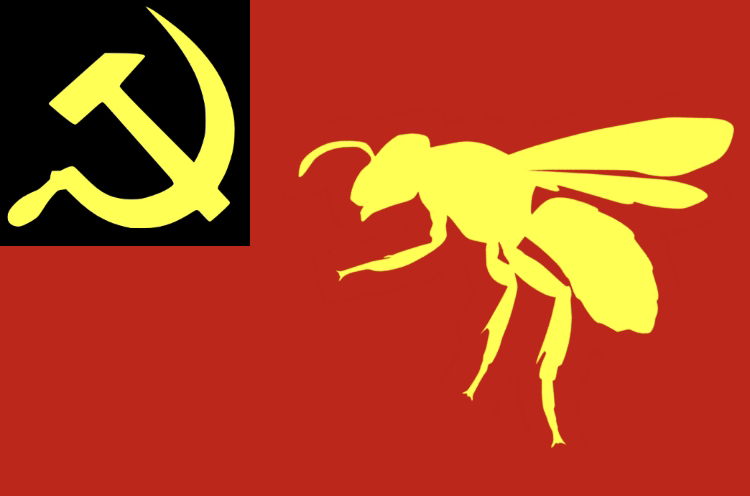
I don't think this looks that bad. A little boring, and no hammer and sickles for some reason 🤔
THEY COULDVE JUST PICKED THE FUCKING NORTH STAR FLAG IT WAS THAT EASY
I feel like every time I see the updated version of the new flag it gets worse. Like didn't it used to have more colors?
Counter point: Vexillogy is in fact good and seal on bedsheet is lame. People just took the worst most boring lessons from that TED talk/CPGrey video l/ don’t realize Grey has poor aesthetic tastes that’s the issue.
Counter counter point: Utah having a war over its new flag being “woke” is hillarious.
the smarmy thing about CPG and like redditors is that they codified their bad aesthetics into rules and expectations that they trot around instead of just having preferences.
"the california flag just doesn't do it for me" vs "california's flag has WORDS and those are against the rulrs D- see me after class🤣"
people unironically think Maryland's flag is bad instead of cool as fuck


