
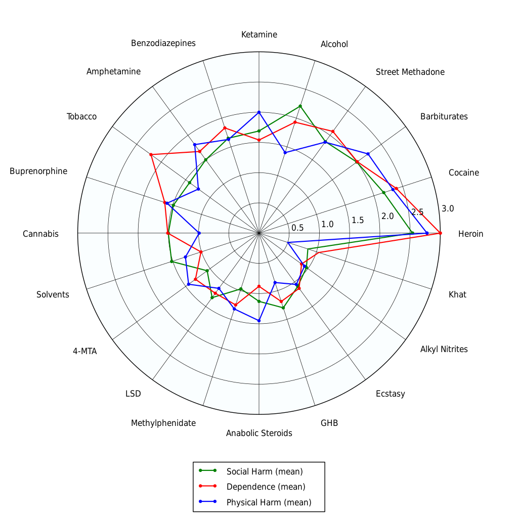
The farther a line is from the center, the worse the drug (generally) is.
Edit: People have pointed out numerous times that some displayed stimulants, though ranking fairly low here, have a large potential for accidental overdosage. Don't take it as gospel, everything has risks that can't be easily plotted.
The chart was made using data from this 2007 Lancet study. It's not perfect, as drug reactions vary wildly between people and the "social harm" green line incorporates the opinions of pigs. It's definitely one of the better risk assessment tools out there since it doesn't incorporate ridiculous drug policies. Here is an alternate mapping.
.svg)
For many drugs, the "experimental" stage of use can rapidly enter dependency. Keep this in mind.
Made in reaction to this post where a comrade outlines family struggles with drug abuse, and how it's irresponsible to glorify drugs and alcohol. Use this chart to determine which drugs to glorify instead.
deleted by creator