milistanaccount09 [she/her] to chapotraphouse • 8 months agor/vexillology and its consequences have been a disaster for the human raceimagemessage-square47 fedilinkarrow-up1103file-text
arrow-up1103imager/vexillology and its consequences have been a disaster for the human racemilistanaccount09 [she/her] to chapotraphouse • 8 months agomessage-square47 Commentsfedilinkfile-text
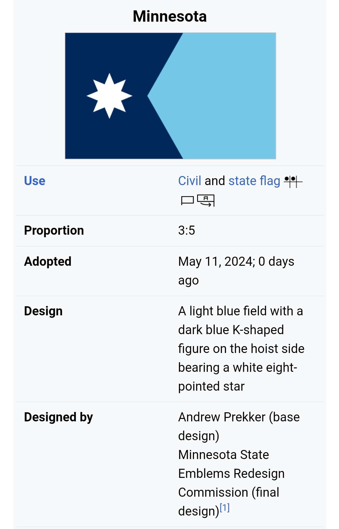
minus-squareя не из калининграда@lemmy.mlhexbear26·8 months agoi believe the biggest problem the lack of contrast. leftist flags usually have colors that POP! it also looks really arbitrary, but this has probably something to do with the fact that its minnesota. linkfedilink
minus-squareMaoo [none/use name]hexbear10·8 months agoThe left side looks like a simplified map of the state, which is kinda fun. link


i believe the biggest problem the lack of contrast. leftist flags usually have colors that POP!
it also looks really arbitrary, but this has probably something to do with the fact that its minnesota.
The left side looks like a simplified map of the state, which is kinda fun.