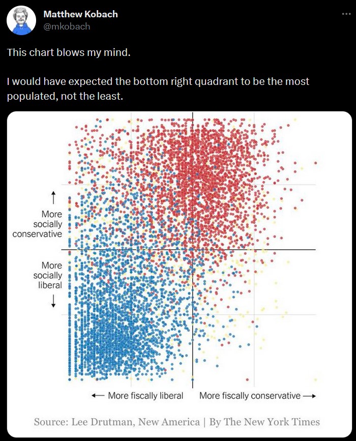
Yeah, you can clearly see how many people just answered as left-wing as possible on any fiscal issues and how another group of people answered as right-wing as possible on any social issue. I wonder how much further outward both graphs could go with a different questionaire, but there's no way to tell what that means without actually knowing the questions asked.


if the chart looks like this I think that's more of an indictment of the survey. they stuck a kitchen thermometer in a nuclear reactor.
Yeah, you can clearly see how many people just answered as left-wing as possible on any fiscal issues and how another group of people answered as right-wing as possible on any social issue. I wonder how much further outward both graphs could go with a different questionaire, but there's no way to tell what that means without actually knowing the questions asked.