You must log in or # to comment.
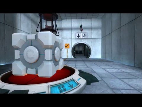
Honestly, the only game aesthetic I find more tasteful than this is like-- if you ever played TF2, do you remember the user created Orange series for control points? Something about the Source test texture aesthetic with the square's pixel size in the corner just rubs my brain exactly the right way.
I found a YouTube link in your post. Here are links to the same video on alternative frontends that protect your privacy:


