For me, it's hands down Flameshot. The best screenshot tool in the world - I've got it hooked up to my PrtScrn key for super easy screenshots.
I also love Kwrite as a Notepad++ alternative, and KolourPaint as a MSPaint alternative
-
Amberol is probably one of the biggest hidden gems in GNOME apps. It's a simple easy music player whose background color changes based on the song's artwork.
-
Parabolic is another GNOME app for downloading videos from youtube using yt-dlp. It's super easy to use and even allows for multiple concurrent downloads.
-
mpv is one of those rare moments where using a proprietary implementation is objectively worse. Must install on any personal computer/mobile device.
How does Amberol hold up with libraries in the high thousands? So many nice looking music played keep struggling with my music folders.
Really makes me miss Winamp sometimes.
Amberol does hold up really well with high threshold music folders in my experience. I had a 24+ hours worth of music that loaded successfully in less than a minute.
Amberol has a "restore playlist" feature which loads your last playlist quickly.
I use Lollypop for music, well in reality i just use MPV for that too lol but i downloaded that "just in case"
Mpv is a good engine, but I prefer something like smplayer+mpv for all the extra functionality. I also like that VLC has tons of features, like full file/codec info and stats. I know there are other ways to get that info, but it's very easy in vlc.
-
Firefox with tree style tabs, with the user CSS that removes tabs and combines bookmarks bar into the title bar.
Away from computer right now but I'll take a screenshot in an hour or so.
And Emacs. :)
Back at my computer now!
OK, here's my screenshot:
Show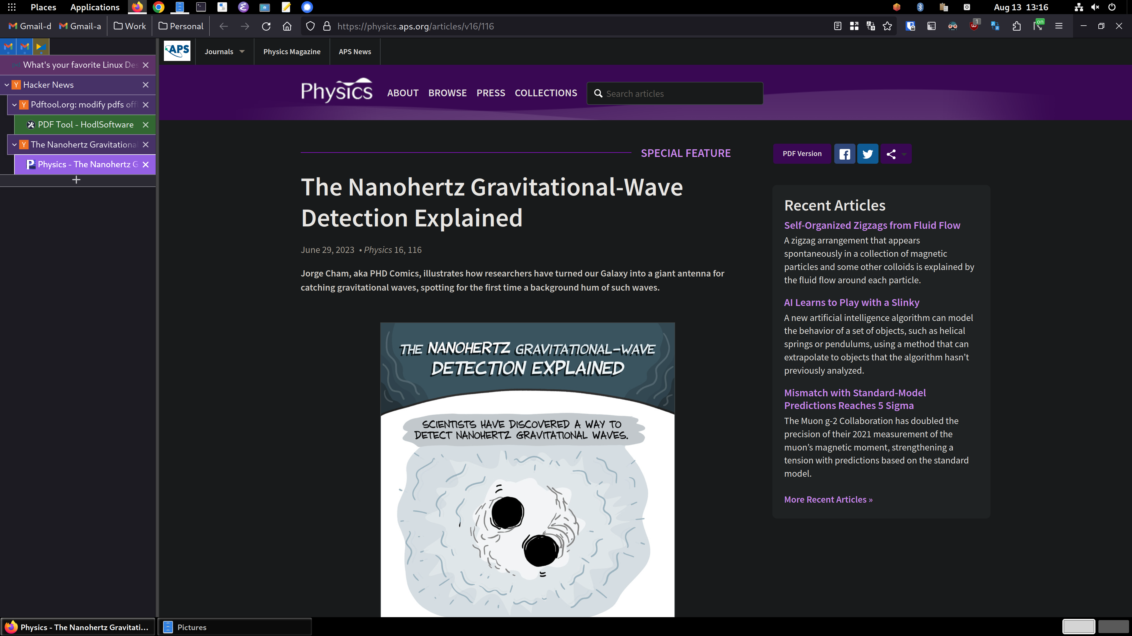
So, you can see the tree style tabs (TST) in the sidebar area on the left. I'm using the "photon" theme for TST. with another extension for TST called TST Colored Tabs. If you middle-button-click a link, it's opened in a new tab like usual, but TST also assigns it as a child tab of the page you were viewing. It's incredibly useful for keeping track of where you are and what you're doing. Especially in my DevOps job, I have dozens of tabs open and chaos would reign supreme if I used top-of-window tabs like standard. You can see the bookmarks toolbar has been dragged up into the title bar using the customize toolbar window accessed by right clicking on the title bar.
To accomplish this you need to enable a setting in about:config called
toolkit.legacyUserProfileCustomizations.stylesheets, set that to true. Then exit Firefox.Then create a directory called
chromein your profile directory, which on Linux is in~/.mozilla/firefox/PROFILENAME/, which you can get from theabout:profilespage. Inside thechromedirectory, you create a file calleduserChrome.cssand add this stuff to it:#main-window[tabsintitlebar="true"]:not([extradragspace="true"]) #TabsToolbar > .toolbar-items { opacity: 0; pointer-events: none; } #main-window:not([tabsintitlebar="true"]) #TabsToolbar { visibility: collapse !important; } #sidebar-box[sidebarcommand="treestyletab_piro_sakura_ne_jp-sidebar-action"] #sidebar-header { display: none; } /* Display the status bar in Firefox Quantum (version 61+) permanently at the bottom of the browser window. Code below works best for the Dark Firefox theme and is based on: https://github.com/MatMoul/firefox-gui-chrome-css/blob/master/chrome/userChrome.css This userChrome.css file was last modified on: 28-Jun-2018. Tested to work with Firefox 61 on Windows. Related blog post: http://www.optimiced.com/en/?p=1727 */ #browser-bottombox { height: 20px; border-top: solid 1px #505050; } .browserContainer>#statuspanel { left: 4px !important; bottom: 0px; transition-duration: 0s !important; transition-delay: 0s !important; } .browserContainer>#statuspanel>#statuspanel-inner>#statuspanel-label { margin-left: 0px !important; border: none !important; padding: 0px !important; color: #EEE !important; background: #333 !important; } window[inFullscreen="true"] #browser-bottombox { display: none !important; } window[inFullscreen="true"] .browserContainer>#statuspanel[type="overLink"] #statuspanel-label { display: none !important; } /* Begin section to move system UI buttons to the same UI bar/box as the addressbar */ /* Adding empty space for buttons */ #nav-bar { margin-right:100px; } /* For dragging whole window by mouse*/ #titlebar { appearance: none !important; height: 0px; } /* Fix for main menu calling by Alt button THIS BREAKS THE UI!! */ /* #titlebar > #toolbar-menubar { margin-top: 10px; } */ /* Move minimize/restore/close buttons to empty space */ #TabsToolbar > .titlebar-buttonbox-container { display: block; position: absolute; top: 5px; right: 1px; }And there you go! TST has more tips and configuration details in its Github project: https://github.com/piroor/treestyletab and https://github.com/piroor/treestyletab/wiki/Code-snippets-for-custom-style-rules#for-userchromecss
emacswithdoomFTW.Looking forward to learning how to get tree tabs in FF.
I updated my original comment above yours. I hope my comments/instructions are understandable, please let me know if I wasn't clear on anything!
Alacritty, Tmux, Zsh, Syncthing, Stremio, Fopnu
The problem is that the more I use a program, the more flaws I find. So, there are a couple I use a lot, but I can't say they are my favorites because of those flaws that I only notice after using them extensively.
I wish there was a website for finding Linux software with popularity, ratings, categories, recommendations and trending software. Similar to https://pkgstats.archlinux.de or https://www.linux-apps.com
While maybe not the perfect match for your search, alternativeto.net might be interesting for you. As the name implies you can search for alternatives for a specific piece of software or just browse through some categories to find something you might like. Comments and reviews will be there to help you out more. Just remember to filter by linux, as you might get results exclusive to windows or mac, and by whether or not the software is free and maybe also open source if you only want to use those.
Way better UI, no hussle with configuration, flatpak support is seamless. Very good experience over all, such a smooth game adding -> configuring -> playing experience.
If based on the thing I used most then it has to be Firefox!
If you want something more trivial but personal,
openttd- the best game ever. :)The kernel. I literally can't use my computer without it!
Jokes aside, I'm a big fan of Kolourpaint too.
tbf the zen-kernel is a really cool thing to have if you get it package correctly into your system.
It is, and I've used it for a while. I don't recall why I stopped it, it was a long time ago; perhaps I didn't notice any meaningful difference in performance? Stock kernels are good enough for most purposes.
I've replaced Flameshot with Spectacle on my system because it is preinstalled on Plasma, has almost the same set of features and, in my experience, work snappier. Also, Flameshot can have issues working on Wayland
Yeah Flameshot is probably the thing I've been missing the most on Hyprland. Idk why since in theory it should be able to work but I could never get it to so I've been stuck using a much worse solution for screenshots
xorg. I used its predecessor a lot in the past, and I still get PTSD when I see an XFree86 config file.
By far it's Kate, even though I'm now a neovim user. It's just a great IDE.
It's probably Neovim. I spend most of time in a day while working on it. Its suitable for almost all code and text editing jobs.
Also I should have to add okular which is really nice for reading pdf's and mangas.
I like KDE Connect quite a bit. Its a great tool to show of in front of my Windows friends and super usefull for media control.
The question is weird to me, but I'll plug Strawberry Music Player. It's a fork of Clementine, which was a fork of Amarok from when Amarok was still good.
Kate, Terminator, k4dirstat and the amazing clipboard history app in KDE.
Not sure if it counts, but
obsidianfor notes and my daily journal, andlatte-dockto replace the stock KDE app bar.Oh, and
emacswithdoomfor general text editing and most coding tasks.Based on time spent using them, Firefox, Steam, and Terraria. Wait, do games not count?
The real answer is actually probably Gnome itself. The DE, I mean. The workflow suits me perfectly, and I even like a lot of the basic Gnome apps, although their naming convention get on my nerves sometimes (your official web browser is called "Web" and your official music player is called "Music"? But the one that makes me actively angry is calling their official text editor... "Text Editor." C'mon, folks.)
This has been the case for me since Gnome 3 dropped. Which was quite a surprise for me since I thought of Gnome 2 as a less user friendly, uglier XFCE and kinda hated it. I still kinda feel that way about Mate, but Memo kicks ass and it's much better than Gnome 2 was overall.
Oh man I thought I was the only one when it comes to the naming conventions. I've seen it on Cinnamon as well and it's absolutely annoying if you want to figure out the exact name of the software, only to get hit with "Text Editor" but I suppose this does make it easier for those new to Linux to get accustomed to their new environment (probably also the real reason they do this) though I still wish we could switch that behavior off somehow.
Well... kind of. The difference is that the official Gnome text editor's actual name is Text Editor. It's not a case of the desktop calling, for instance, Pluma or Xed "Text Editor". The Gnome music app is literally called " Music."

