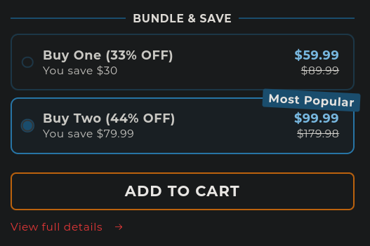
It's pretty easy to spot dark patterns when you look out for them, but I found a pretty obvious example of this.
Stoofie is a brand that sells water fountains for your pet (I don't know what the problem with a water bowl is, but I digress). WayBack Machine
Plastered at the top of their website is "33% OFF Ends Today- Free Shipping" with no way to dismiss it. There is a scrolling text under the main image "FAST AND FREE SHIPPING 60-DAY FREE RETURNS"
If you scroll down, you're immediately introduced with a product with the option to buy two preselected. The rest of this section explains itself:

Other things are sprinkled in the main page, but it really is the prime example of dark patterns. I am personally sick of finding them, but would love to see more examples of what others have found. Please, share your favorite examples of dark patterns. Don't forget to archive them first so they can never be lived down.
(I don't know what the problem with a water bowl is, but I digress)
(cats are more likely to drink moving water than still water since moving water is less likely to have bad things growing in it)
Huh. I always wondered. When I'm poiring our dog water to the bowl when hiking, he always prefers to drink "from the bottle" - the bowl is there basically to catch the rest to return to the bottle (or for the other dog to drink). Guess now I maybe know why he does it.
Most cookie consent dialogues:
- There’s only one big accept button
- If the decline button even exists, it’s grey whereas the other one is green.
- The decline option could be buried deep under other menus.
- The sizes of the buttons
Most companies are trying to actively manipulate you to accept all cookies, but nowadays there are a few companies that don’t resort to any of these dirty tricks.
The one that scares me the most is:
Accept all or Settings
And you have to opt out 5-10 buttons and at the end there is a "save settings" or the "accept all" button again in green.
Who has time for this shit? Just for a stupid article? We need laws against these.
"We care about your privacy. We absolutely hate it, but it counts as caring, doesn't it?"
That's actually a nightmare
Who has time for this shit? Just for a stupid article?Won't using reader mode ( if your browser supports it ) help you avoid this ? or those browser add-ons like " I don't care about cookies "
Oh I remember those thoroughly cursed menus where you have to manually disable 256 cookies one by one. Haven’t seen those in a while though, so I guess some piece of legislation is doing its job.
You forgot a million switches for each "partner". More like prostitution.
Based on the number of partners some companies seem to have, they are far more promiscuous than most humans.
Yeah, EU fixed that somewhat, it has to be privacy-by-default now, the save choice being pre-selected and obvious and etc. But most dialogues are now illegal; no legal entity complains, nobody fixes it.
Stupidly enough, that's illegal in the places this ruling is from. What's going on there?
Working for a certain big fucking corpo(that I utterly hate from bottom of my heart but don't really have an option to leave), I see those patterns all over the product. Not just that, its practically impossible for non tech savvy to choose a non bundled or cheaper product or plan because it's burried somewhere out of your sight
If they sell to anyone in australia let our consumer protection agency or whatever they called know. They tend to actually follow through with fining companies shit like this.
One of the worst shopping basket designs I have ever seen, was where they added additional items together with the thing you wanted, forcing you to remove the thing they added before paying.
my favourite is Amazon's:
- buy without prime (2$ shipping fees)
- buy with prime (free shipping)
exept you must pay amazon prime 10$ and it's a monthly recuring subscription.


