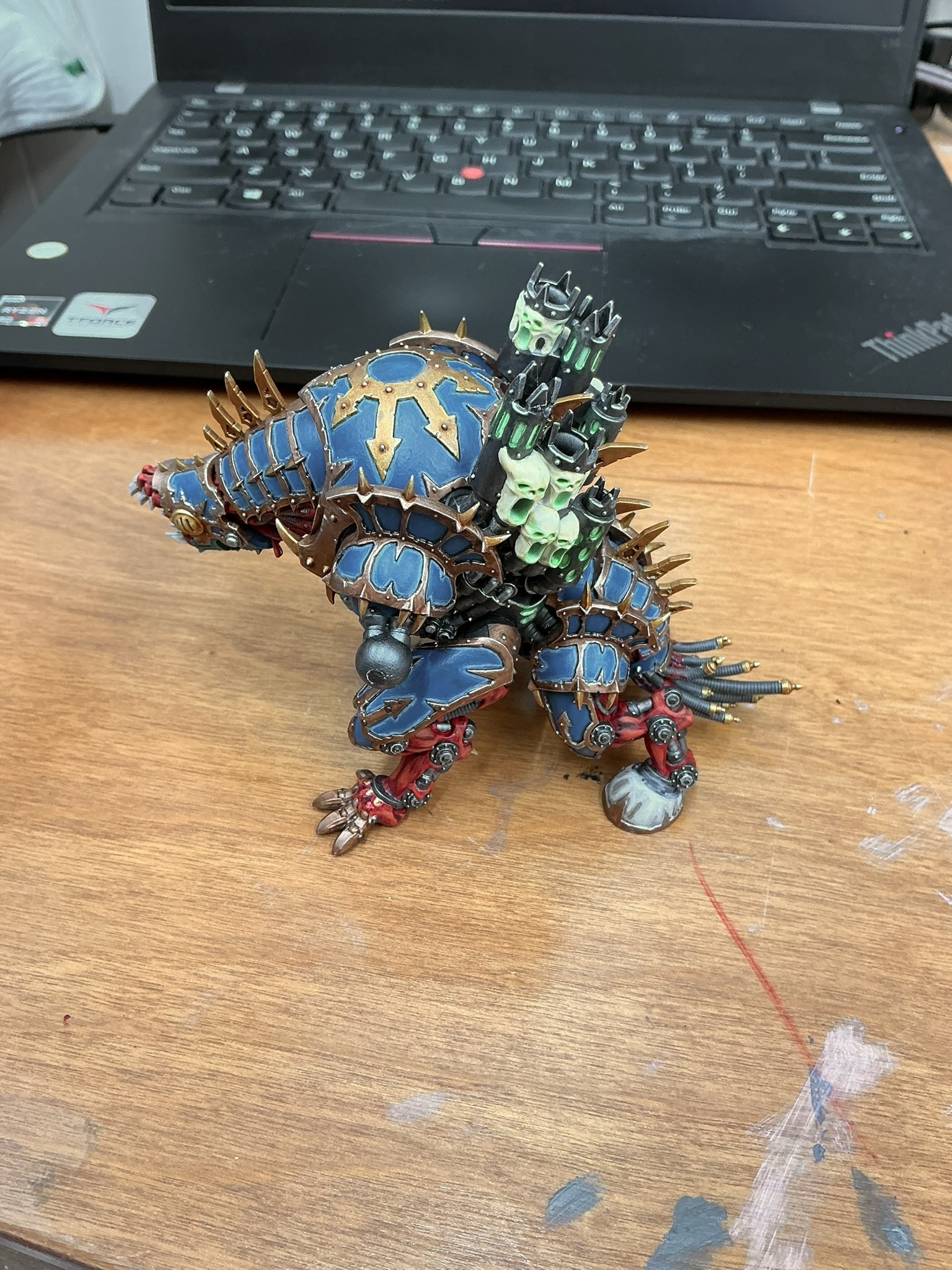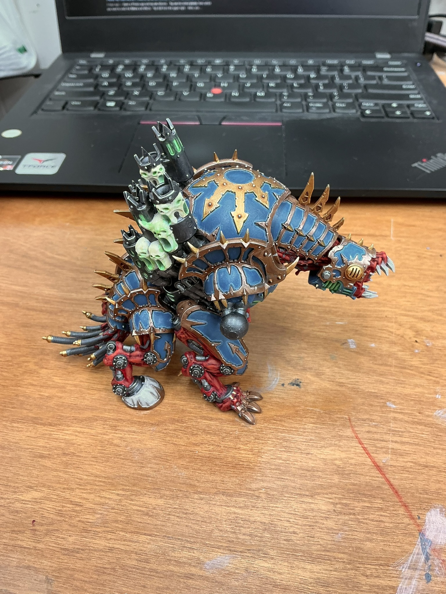


Except it's not finished. I had to put down the brush for the past week due to illness, but I picked it back up tonight and finished the body and head. Now I move onto the arm weapons and I'm going to at least base them tonight. But I went with Thousand Sons colors as it's for that army in particular. Mind you I make some personal changes for personal tastes, but they're the overall colors minus yellow...which I can't figure out where to put it. I also tried making the skulls or spirits or whatever on the smokestacks look like they were made out of tallow candles while vomiting ghost light. I could've done better, but I was super tired when I painted them. There are a few mistakes that I'm not going to go over and fix cause I don't think they're super noticeable, but maybe. IDK. Maybe find a way to smush in that yellow somewhere if I'm feeling spicy.
Also, I use blue-white light in my painting "studio" and I can't get the color to come out perfectly with my iPhone's camera. It keeps throwing a blue heavy filter on it and I can only correct it so much.

I'd probably highlight the metal with more yellowish gold, if not directly mixing yellow into your gold with some silver. If you add yellow anywhere else, it's going to ruin the nice contrast you've established and make it look too busy.
The other solution would be to paint the neck plates alternating colors between yellow and blue. This also helps tie it together with your Rubric Marines if you have the motif there with their crown/horn/idk wat you call it.
That’s a really good idea for the gold. I honestly just followed the citadel app on that one cause I simply don’t have the full experience yet as I’m very new to the hobby.
I’ll probably stick off the yellow cause there’s simply nowhere to put it and it’d throw off the look of hamfisted in. I would like it to adhere to the rubric color scheme, but I also have rubrics that are HH color scheme as well, so matching isn’t 100% necessary.
Something else I forgot to mention: light behaves differently on large objects because of how our brains interpret what we see. Your highlights are really good and like I said, you have good contrast (which is important when playing a game because it helps you quickly identify what's what on the table). The one thing you could add is volumetric highlights and shadows, which is a step you wouldn't need on infantry models. Large demon-dog-machines, on the other hand, will cast shadows over parts of themselves in ways that would be noticeable IRL. Example:
Notice how the turret casts a shadow over the tank's hull. The underside makes the inner part of the treads almost black, especially compared to the ground outside. The person in the turret, on the other hand, has a pretty uniform distribution of light coming from one direction. So:
This is something I'd suggest doing on your model. However, you're like 99% done and this step would take about as much time as the rest of the model only to get that last 1% of polish. And it's not really adding much that impacts gameplay or how it will be perceived from two feet away.
Yeah, that's something I took into consideration when I didn't highlight certain plates on the armor, but I didn't extend it to all the highlights because I was afraid of mucking it up. After all, this was a large project for me and my first large model. Hopefully I get to that point one day and am confident enough to attempt shadows of that level.
Thank you for all the critique. I am very thankful for it.