More Pics
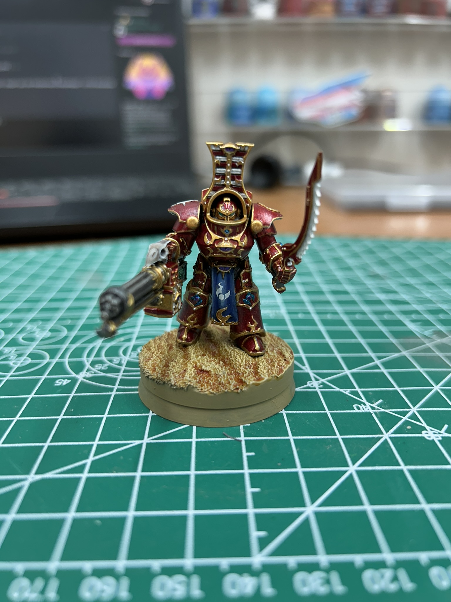
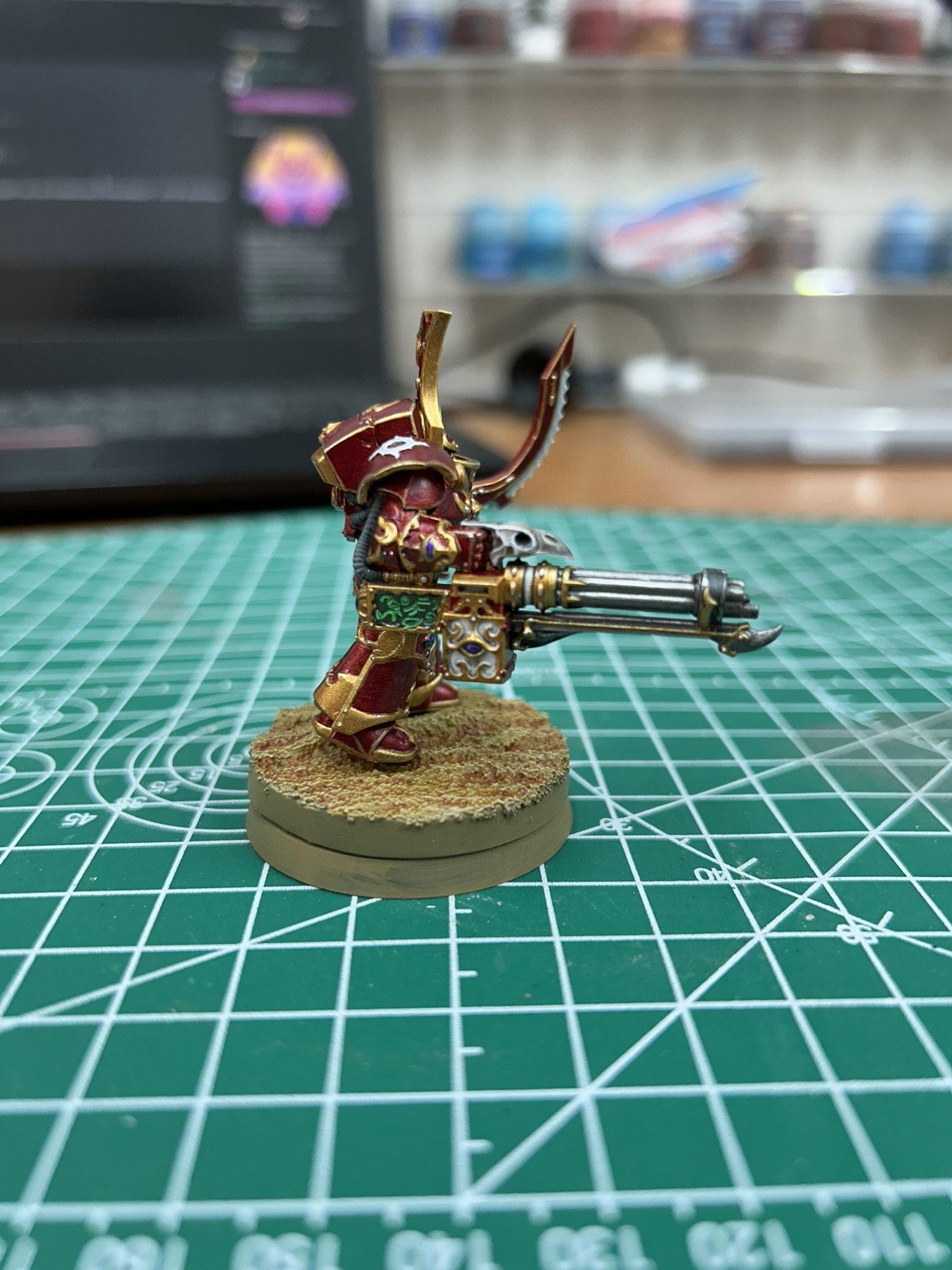
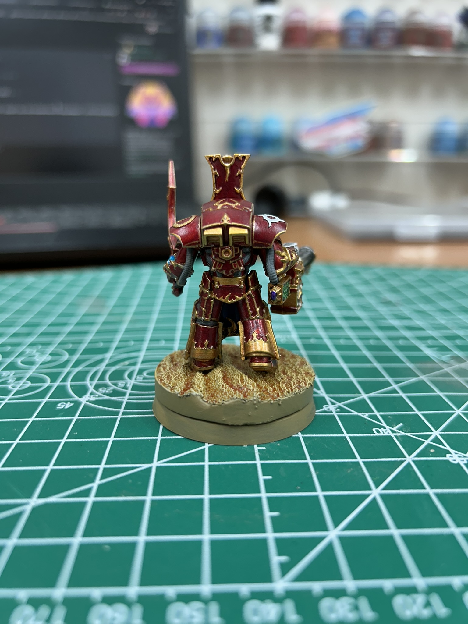
I have more pics, but the site must be limiting me or something. Just another side profile and something showing it from an above angle. Worked on this today and yesterday and wasn't very fond of the method with which to apply the candy apple red. I genuinely don't like working with contrast paints. But, as far as I know, there're not metallic reds that look right on the market, so I have to suffer with it. Also not fond of the white loin cloths, so I went with blue this time. I think it worked out quite nicely. Aside from a couple minor mistakes, I think it looks pretty good. Lemme know what you folks think.
I'm also just realizing how awful the color on my laptop's monitor is. The colors are so washed out. I should calibrate it.
Wow that looks great! The blue loincloth was a great choice and the gold especially looks so ⚜️🤩💎

If you want candy apple red metallics try mixing your contrast paint with silver. Even better if you have silver ink. A little bit of yellow or orange can brighten up the red if it's too dark.
Looks good! Very crisp highlights (especially on the crest!), and well done on all of the tiny trim. Yeah, Hexbear has a built-in image limit of I want to say 5/hr? Found that out when I posted my last big album lol.
I think the red looks pretty good, but for the sake of troubleshooting, some ideas:
- It's hard to tell how glossy something is through a photo, but maybe it would look more "candy" if you put a gloss varnish over the red?
- Could try thinning the contrast red more, don't know if water would work or if you'd want to use medium
- I think that back in the day before contrast paints, the advice was to use Tamiya Clear Red over a gold base, but IIRC that's an alcohol-based paint and was usually airbrushed.
- Alternatively, I know TurboDork make some acrylic metallic reds but I have no idea which one (if any) would be a match.
As someone who paints a lot of white, you made the right call to do as little of it as possible, lol. The blue loincloth will also help it look cohesive if it's in the same army with other units in the 40k scheme like the forgefiend.
How'd you do the base, looks like maybe clay with texture from a roller?
I couldn't get the lighting quite great on these pics as I'm no professional. I actually had a coat of glossy varnish on this model. It wasn't a thick coat, but it definitely helped bring out the color. I'm just very not fond of using contrast paints. Even applying them correctly, I still have this aggravating issue of them pooling like they're a wash. For me, it can be kind of tough to get a nice, even coat on the model with them.
I actually 3D printed the base. I used the "Dunes" base from Zabavka Workshop on MyMiniFactory. I simply printed it, hit it with PVA glue, dunked it in sand, put a coat of varnish on it, primed it, then paint it.
Yeah, fair enough, contrast paints are very much not designed to work over big flat panels. Still probably better than one video I saw a while ago of a guy doing the same thing but with like 10 layers of a red wash lol.
Now that sounds like a nightmare. You won't ever catch me doing that, lol.
