

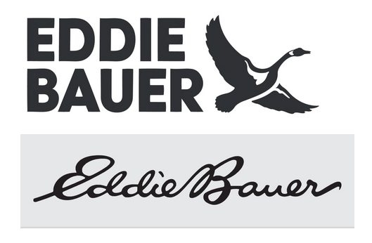
Eddie Bauer logo ditches the script because Gen Z doesn't read cursive
It’s a major rebrand that launches on Eddie Bauer’s digital platforms today and will start to appear at international brick-and-mortars on a rolling basis. By fall 2024, all Eddie Bauer products will begin to feature the updated logo.
[...]
Though Bantle and his team initially toyed with the idea of keeping the script font, the general reaction they received was that it looked dated and, to some, confusing. “A big part of what I’m going to need to do here is reintroduce this great heritage brand to the next generation,” Bantle says. “And kids don’t even learn to read cursive in school anymore.”
No! No!
The goose icon is good, use that as a secondary icon. But god, if you need to make the logo more legible, just change (or ditch) the approach stroke on the first E.
deleted by creator