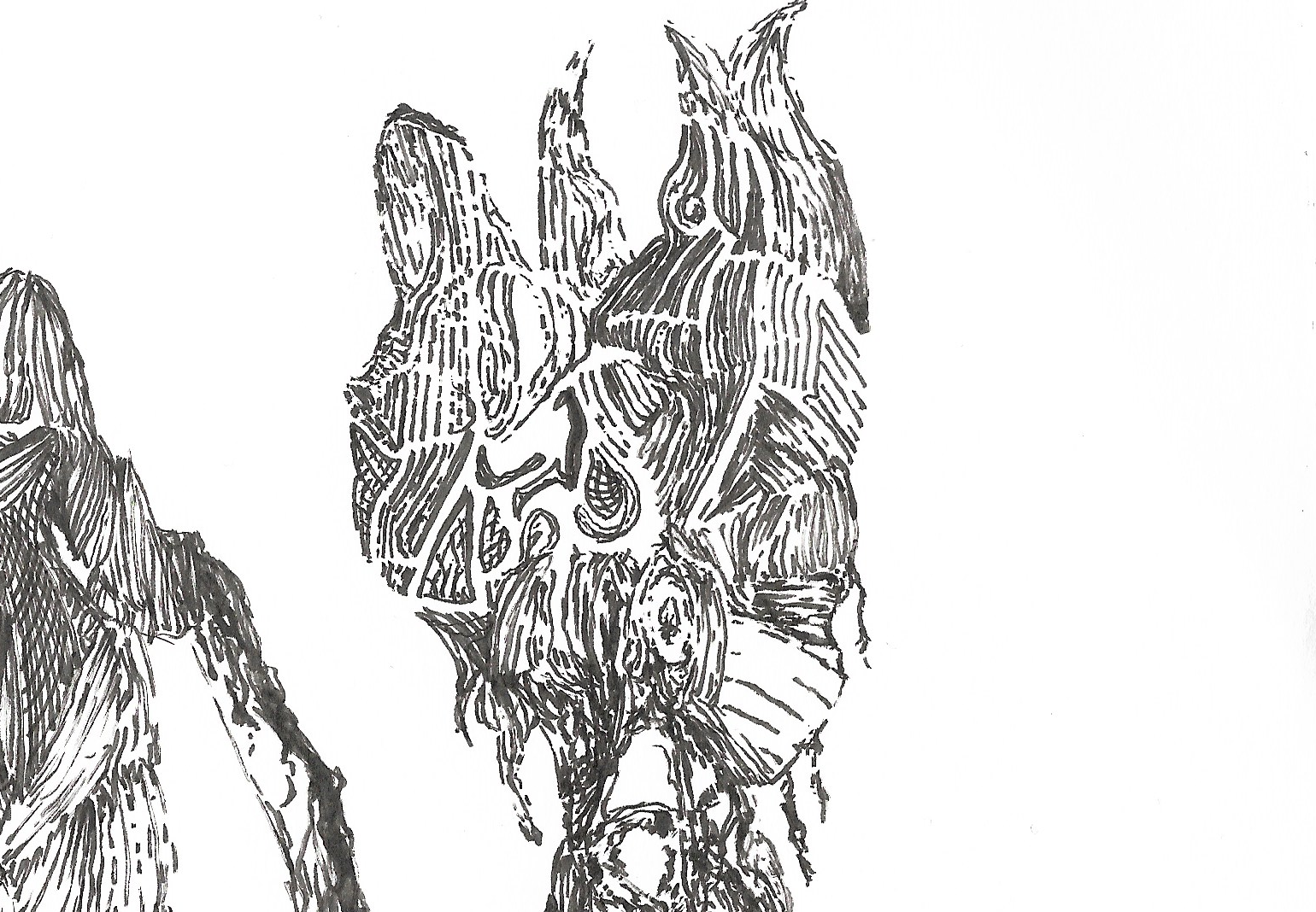
I tried with one drop to fit minimalist intent:
Show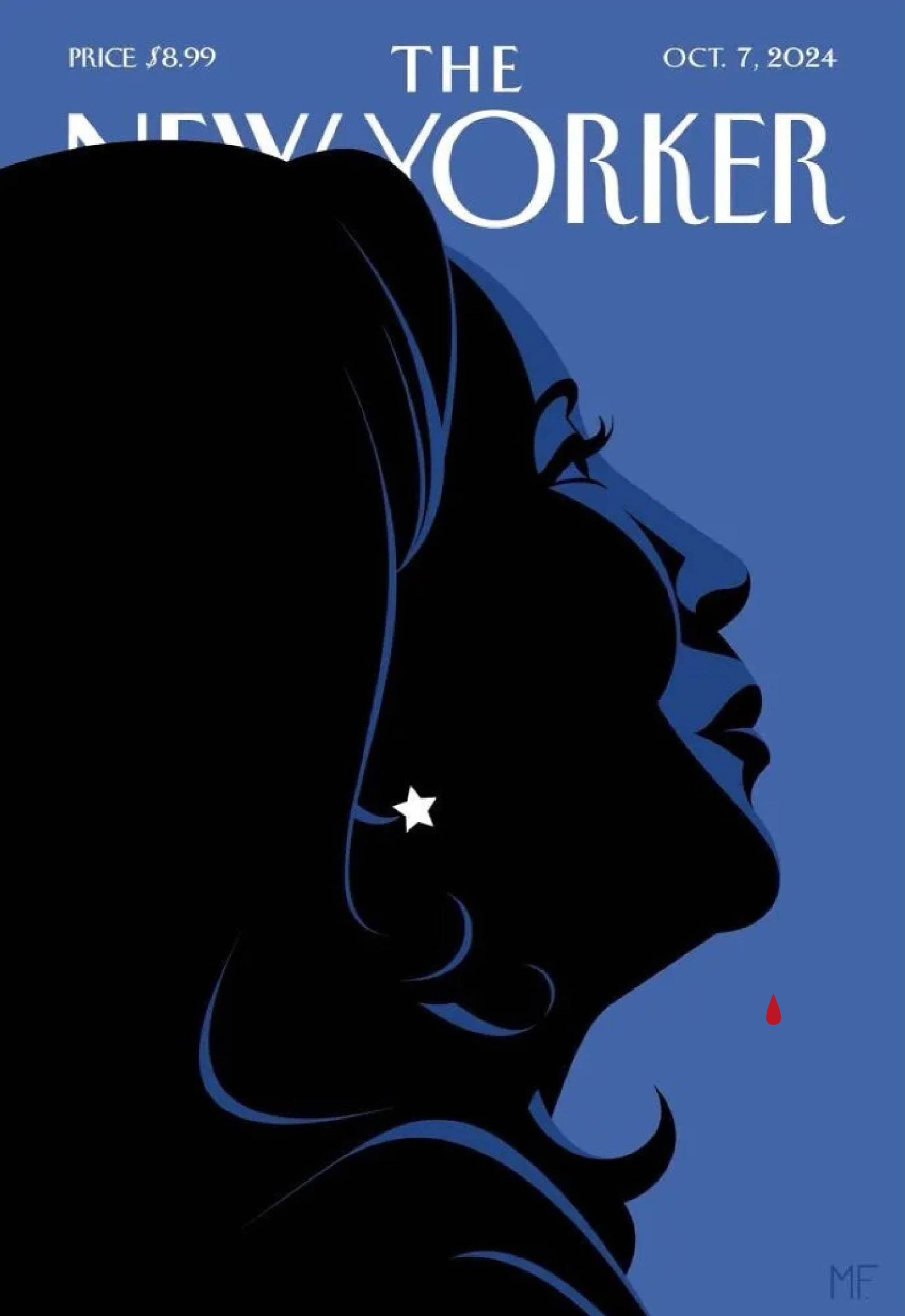
It's still a little goofy looking with three, due to spacing (and I can't draw for shit)
man fuck minimalism people can't do subtlety i did this up edit: even LESS SUBTLE slightly revised lines
Show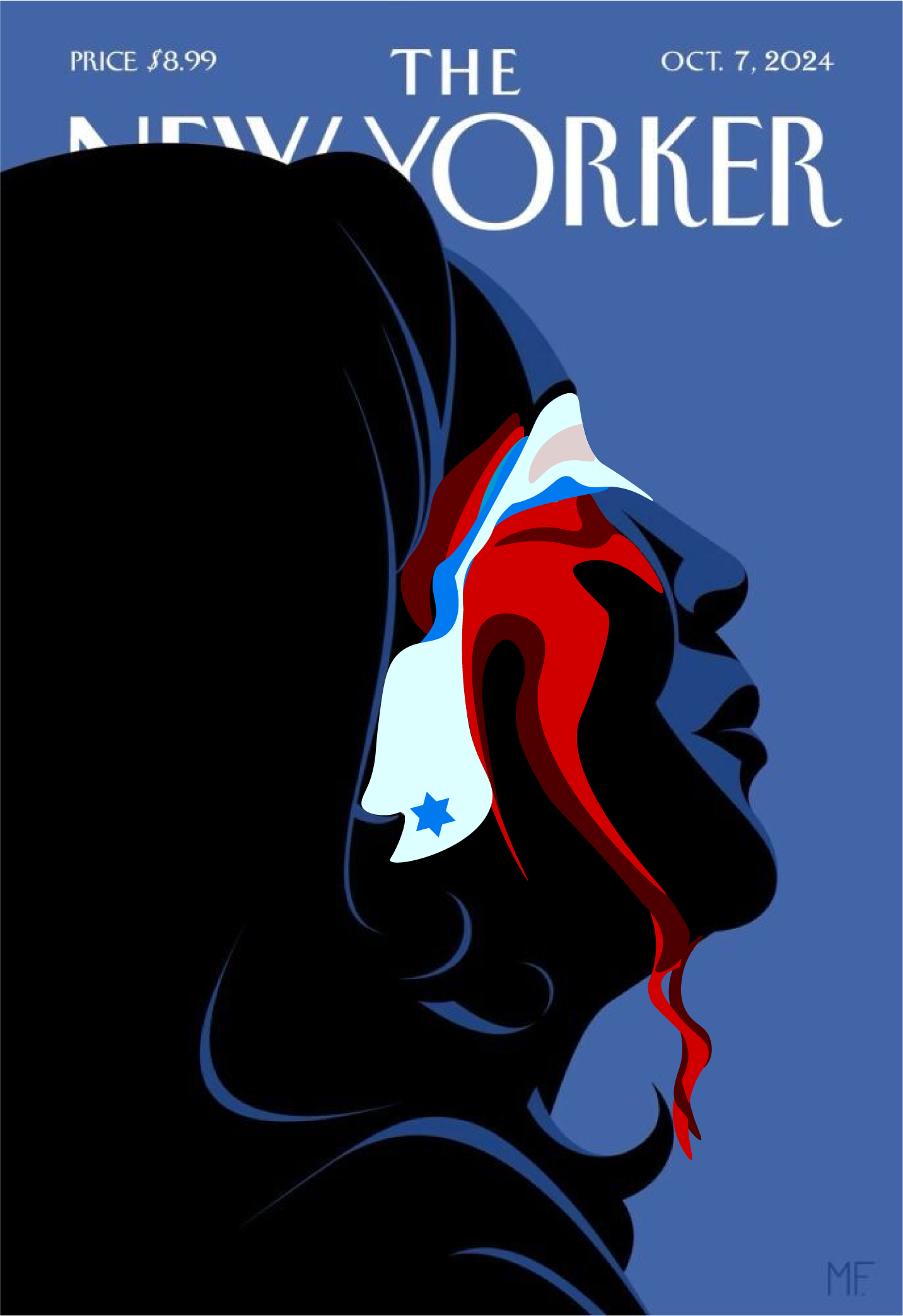
I thought she was going to win, but I feel like this is a death nail. I'm getting flashbacks to Clinton with the whole charade of anointing her and ignoring her unpopular positions.
I'm getting those vibes too. All we need is a
 cover to go with it.
We need an update on that meme from 2020 of the crying wojak of Biden losing with the posters behind him being Hillary crossed off then Beto crossed off etc. but with Kamala.
I sampled 1
 and they thought this was bad taste
Also someone add the hat

Ugh, my dad loves this magazine.
I'm thankful he's not a chud, but he's old and holds on dearly to liberalism.
Someone correct me if I'm wrong, but aren't the target demographic of the New Yorker exactly the type of people who'd also be ride-or-die for Kamala? Doesn't seem super surprising.


