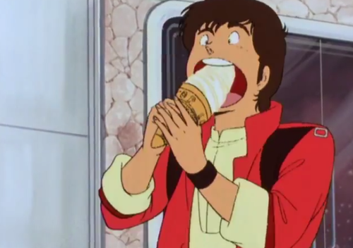
early box art concepts actually did feature chief doing a 'soypoint'
I feel like its likely a problem I'm recognizing and remembering so many hexbear posts
Dusting off the heritage Christmas memes for the holidays :)
It's one of my favorite pictures of all time and I only get to post it once a year
It looks like it might be gibberish. It alternates between Webdings and Wingdings, and it's hard to read because not only is the pixel count pretty bad to begin with, but it has also been flattened vertically by about 50%. Here's a version with the aspect ratio corrected:
Show
Scaling really butchered some of the pictographs, but at least some of the characters are identifiable on here:
Show
Feel free to double-check my work (I'm half asleep and less than half sober), but here's what I've got:
- Lines 1 & 2: Webdings:
njm kqnji foi2- Lines 3 & 4: Wingdings:
oihqvojbdl k vnlq oh- Lines 5-7: Webdings:
lI [GRILL]
s.slblkM4
jiaslkfv
Edit: Here's the best I could do at re-creating it (minus the
GRILLpart; I couldn't get Unicode alt glyphs to show up in my editor):- Full-res, normal height, 16 point Webdings + Wingdings:
Show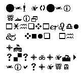
- Full-res, 50% height:
Show
Either way, it just looks like mashing random keys, although the first line gets awfully close to spelling out "Shinji"
