
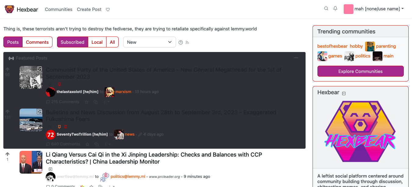
I didn't know where to post this, so I hope it's fine here. I use the 'litely' theme on Hexbear because I need a high-contrast setting that won't strain my eyes due to my low eyesight. Unfortunately, the 'Featured Posts' section is completely unreadable. Could somebody please fix the CSS of the 'litely' and 'litely-red' themes?
That's how it looks like:
Show
Thank you!
oh yeah, I believe that's the branch where the actual production code lives
what's weird is I think this feature was upstreamed, so idk why we'd have custom CSS for it.
Current upstream UI does not have a separate div with .featured-posts class. Only the post titles are coloured a bit differently. It's not very intuitive unfortunately.
ah, interesting. Yeah I can see why that was changed, shame upstream didn't take it. I can't be trusted with CSS or really javascript otherwise I'd take a stab at a PR