
Edit - Someone said the image is from August, which is true. Here is a link to an updated pic.
fucking lmao.
I hear they might that bakhmut tho and they do look close to that. No idea whats going on with russia. Why've they stopped advancing?
Edit - Someone said the image is from August, which is true. Here is a link to an updated pic.
fucking lmao.
I hear they might that bakhmut tho and they do look close to that. No idea whats going on with russia. Why've they stopped advancing?
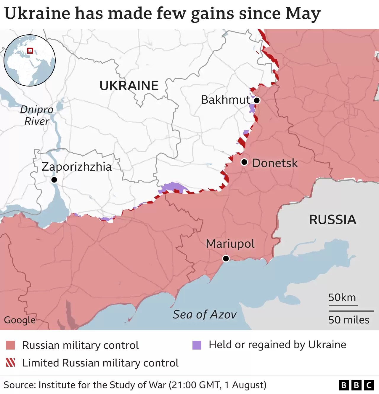
Or idk you could look at not just a unique time slice you pick for propaganda https://www.bbc.com/news/world-europe-60506682
Is there supposed to be a huge difference
Am I missing something or...isn't that the same map? it's even stated in the body of the post
Yes, you are missing quite a lot
I make approximately thirty square miles of difference total, or basically within the margin of error for a map like this. So no difference.
Huh. I wonder what all that red means
There is literally no difference between that article and this lmao.
Half a million people are dead over lines on a map and you bloodthirsty shits are arguing as if it's fucking worth it.
Whose bloodthirsty? I'm saying the invaders should leave and stop killing people. Anyone pushing for Russian aggression is probably just a Russian plant. They got that good good propaganda.
I think they meant "How many dead Ukrainians is it worth to keep a portion of the country full of people they don't like within their de facto governance?" I don't see anyone pushing for Russian aggression, I see people frustrated by the body count compared to the results on the map.
I think this NATO bot got lost, poor sweet thing.
From the infograph at the bottom of the article it looks like nothing has happened in the 'Ukraine advances' section
https://files.catbox.moe/cfv8op.webp