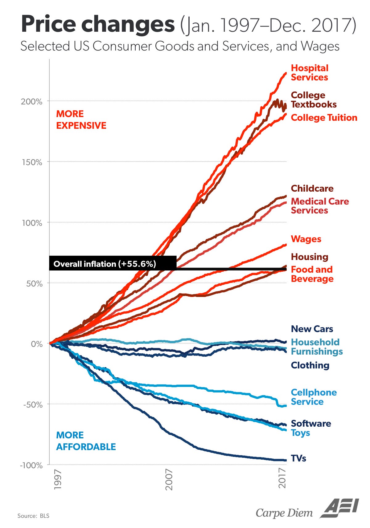
Holy shit this chart is from AEI, a very right wing think tank. I looked it up and here is the article they wrote about it: https://www.aei.org/carpe-diem/chart-of-the-day-century-price-changes-1997-to-2017/
Their conclusion:
Blue lines = prices subject to free market forces. Red lines = prices subject to regulatory capture by government. Food and drink is debatable either way. Conclusion: remind me why socialism is so great again.


Holy shit this chart is from AEI, a very right wing think tank. I looked it up and here is the article they wrote about it: https://www.aei.org/carpe-diem/chart-of-the-day-century-price-changes-1997-to-2017/
Their conclusion:
:galaxy-brain: :brainworms:
Famously unregulated toys, electronics, food and beverages
And cars lmao
Ah yes, socialist and highly regulated college textbooks and tuition. My favorite.
That's a take so bad that I started imagining slamming my head into a wall. Powerful stuff folks :angery:
Emote request: Galaxy brainworms
All I see from this is regulatory capture means the capitalists are prevented from producing this with slave labor.