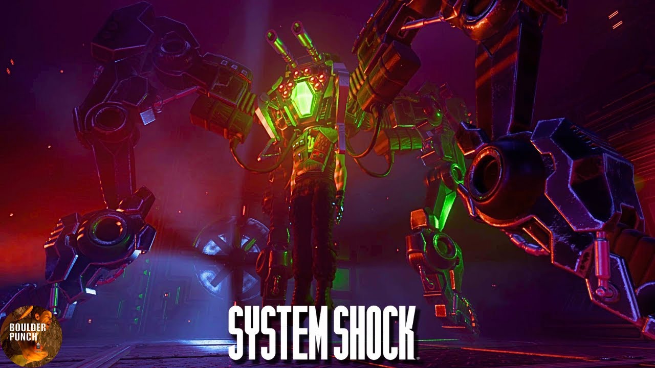
Tbh the game looks visually like the worst of both potential worlds to me, personally.
Too high definition to capture the retro aesthetic, but the architecture and structures are left in their clunky and simplistic state, so it all just looks kinda shitty and overtly video game. The neon light aesthetic doesnt help on that front either.
Sort of like a professional version of those HD texture pack mods that get released for old games and generally get disliked by the remaining nerds for fucking with the cohesion of the visuals.


deleted by creator