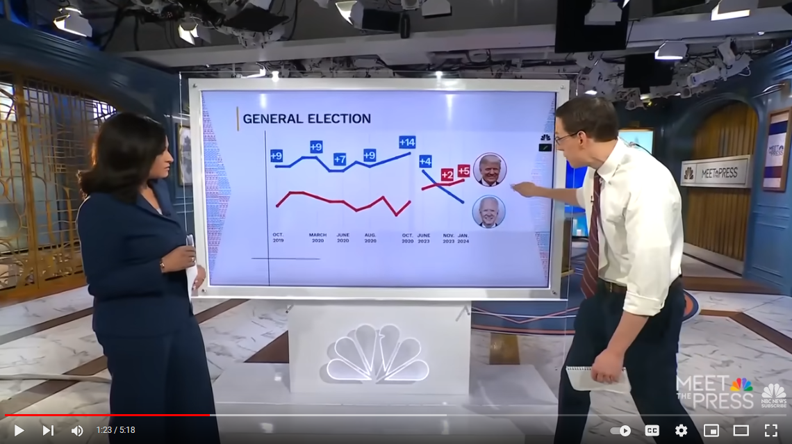
micnd90 [he/him,any] to politics • 8 months agoI wonder what happened in October 2023 🤷🤷imagemessage-square38 fedilinkarrow-up1159file-text
arrow-up1159imageI wonder what happened in October 2023 🤷🤷micnd90 [he/him,any] to politics • 8 months agomessage-square38 Commentsfedilinkfile-text
minus-squarewtypstanaccount04 [he/him]hexbear5·8 months agoUpon closer inspection, this seems to be two different graphs with white backgrounds placed against another white background with an ever so slightly different shade of white. This is still a scummy way of showing graphs. link
Upon closer inspection, this seems to be two different graphs with white backgrounds placed against another white background with an ever so slightly different shade of white. This is still a scummy way of showing graphs.