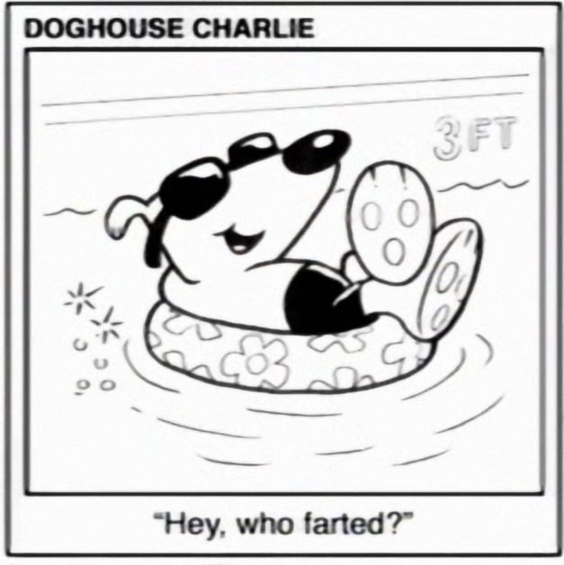
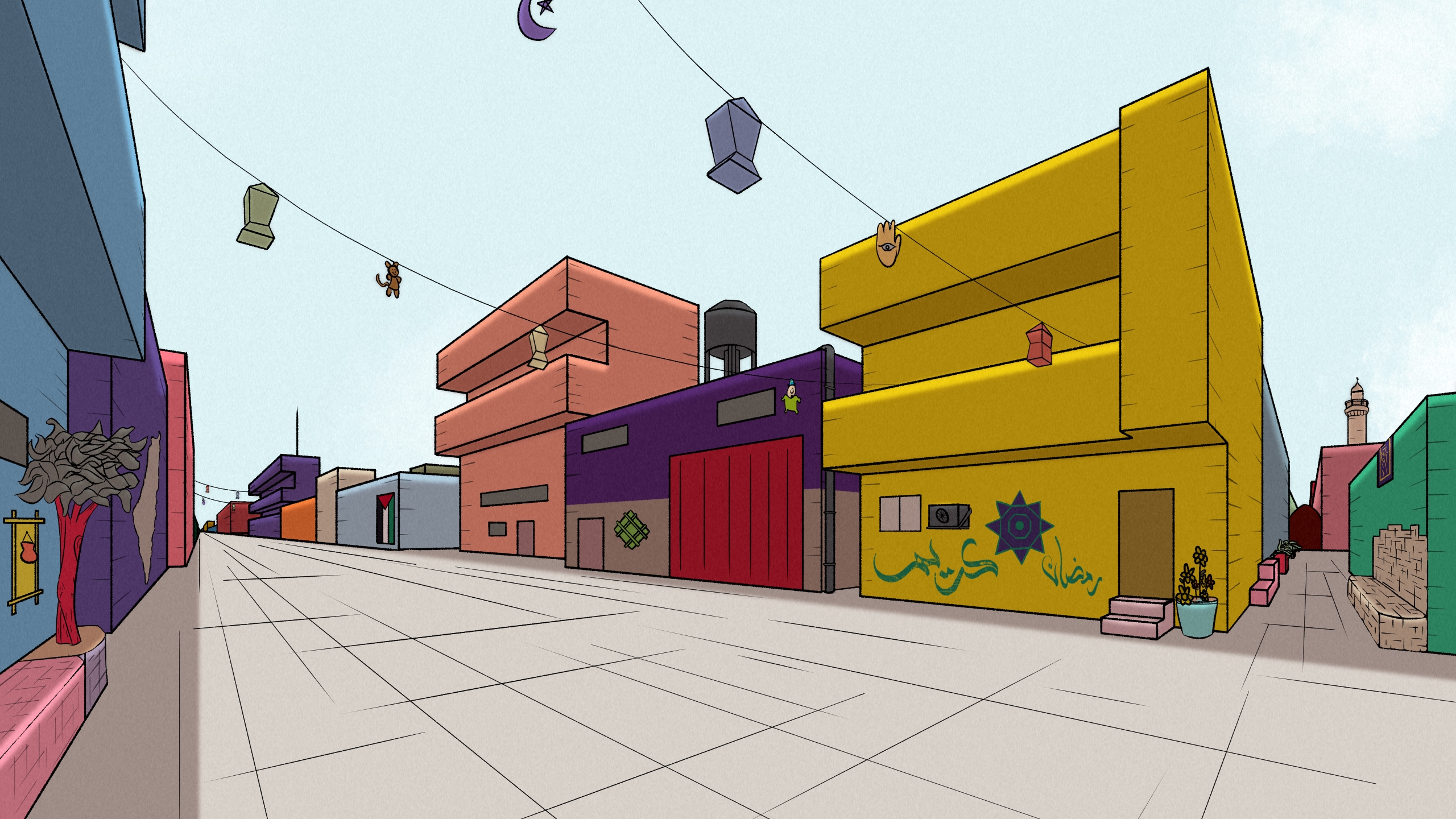
I'm tryna learn perspective and drawing and all that. Got inspired by a Ramadan celebration in Gaza that someone posted about here a few days ago. What do you reckon?
This has a really good sense of depth and the colors are poppin' the fuck off the page. I was tricked into thinking this was a screenshot from some indie FPS game by the thumbnail at first
Aww, thanks~ It's been an easier time learning this than character drawing, I'll tell ya that much!
you coulda fooled me; those buildings have so much character! for real though trying to remember what this reminds me of.
I used a lot of these for reference https://unicornriot.ninja/2023/colorful-neighborhood-in-gaza-celebrates-ramadan-with-vibrant-colors/
I honestly thought that's what it was for the first few seconds after I opened the full image. It's a great style.
I have been binging the Simpsons for the past few weeks...
The middle building feels very moe's tavern but futurama is the one that used a lot of 3D effects so that's probably why my mind went there.
Gotta agree. There's something similar about it that I can't quite place.
I thought this was computer rendered at first. I don’t know shit about art but I have an art friend that told me to start paying attention to what art makes me feel something and this really does. I don’t know what it is, but thank you for making this.
Wow! Beautiful colors and I love the minimal lines & forms here! Looks like such a friendly place
I like the cartoony vibe but I might add in a few more details and greebles and what nots later.
My only critique as somebody with no artistic skill is the sky seems a little too empty or there's too much of one color. It's a perfectly realistic color for the sky to be on any given time of day, but I think if you experimented with more of a very subtle gradient or maybe have it set in a later time of day where one side of the sky would be off-color or slightly darker than the other, it wouldn't feel like all washed out. On the top right corner, I really like how you did the clouds though, those feel really natural like they belong there
I don’t think extra details would ruin anything here! Possibly post the final if/when you do make some changes? 👀
I think some more plants could help liven it up a bit 🌱
but it already looks really good, it's very close to what I imagine housing would like in a socialist utopia - spaces designed for people and community and not cars. simple architecture with vibrant colors, love it
You should try to model this in something like Blender. Would be fun to play with lighting in a scene like this.
I've only dabbled with Blender but it's on the roadmap of things I'd like to learn.
Yo hold up is that a little Vargfren boingyboof i see there? :excitement:
Beautiful and reminds me of parts of Sable, itself an homage to Möbius. Probably because of the clean lines, palette, and house stylr.
i can't remember what this kind of perspective study is called. like 2 point horizon? this is great. mine always came out feeling sterile and boxy to me, like not enough articulation to the structures. your feels like a place that is currently still, but where people actually do live. i really like the hanging lanterns and curios and the realistic slack to the lines. i also like the purple rug on the green building.
the value in these exercises is incredible, imo. i got more into painting later in life and found myself going back to these tricks and some videos i watched about color "value" to suggest depth. i really like art like this, because it turns flat surfaces into windows that suggest other worlds.
i see myself living in the peach colored building, on the second floor veranda. enjoying the shade and the setback while judging passersby.
I really like it, it absolutely looks like a great album cover for the right music. It reminds me of that kind of city pop album art that's inspired by ukiyo-e woodblock prints but modern. First Light and For You come to mind but there's one that's more representative of what I'm trying to say that I straight up cannot think of right now.


