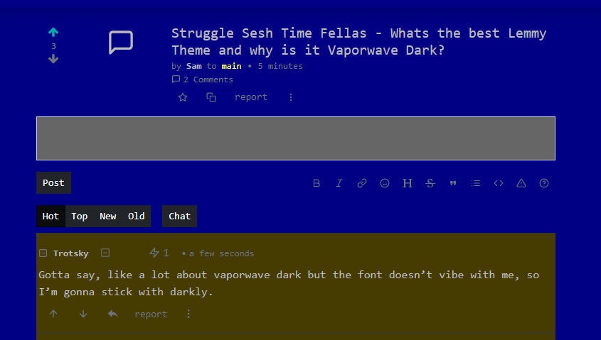
Gotta say, like a lot about vaporwave dark but the font doesn't vibe with me, so I'm gonna stick with darkly.
fuck monospace fonts outside of development, all my homies hate monospace fonts outside of development
Fuck non monospaced fonts.
All my homies hate non monospaced fonts.
I have a weird attachment to this font, I'll write in Notebook instead an actual word processor, and I actively seek out Mass Print Editions of books cause they have the same typewriter font.
Understandable, I don't know if my eyes or brain are just screwed but it's just harder to read for me than something more standard and I don't know why.
It's actually Laborwave, which seems to be the same but with a better font.
I'm rocking solar rn, but laborwave>vaporwave dark because it's basically the same with a better font


