


Reddit man has no standards. Like I kinda agree with him, State seal flags are boring af
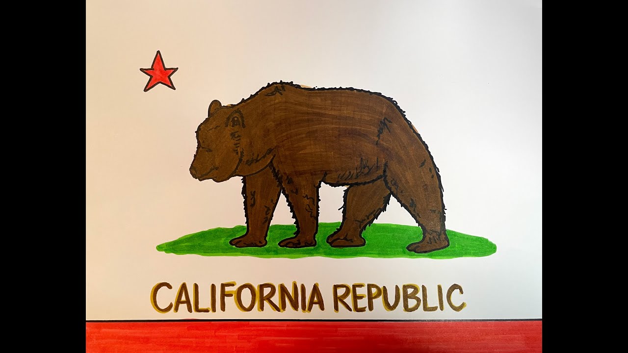
But his extremely reddity argument of every flag has to have straight lines is so stupid. Colorado and Cali have beautiful and instantly recognizable flags. Even if the bear on Cali flag is a bit complex, you dont really have to draw 1:1
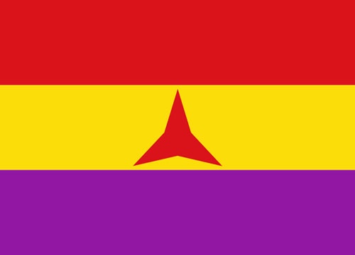
Joel is right here, the wavy one's the best. the star on others look a bit weird.
I love my simple socialist flags like ![]() , 🇻🇳 and 🇨🇳 but there is nothing wrong with more 'complex' flags.
, 🇻🇳 and 🇨🇳 but there is nothing wrong with more 'complex' flags.
My favorite Minnesota flag is still the one where it's California republic but a picture of a mosquito instead. Honestly I've been coming around to "all us state flags should be boring and samey because all the states are fundamentally interchangeable"
all the states are fundamentally interchangeable
As an Ohioan who lived on the west coast briefly - this is fucking hilarious
bring some Californians here and tell them it's basically the same, I dare you 😂
idk, maybe it's different now, but right before I moved out west 20 years ago, I moved to Virginia for a few months and got roasted any time I called carbonated sugary beverages "pop" instead of "soda" or "cola." There were lots of other confusing differences around expected pleasantries and social obligations, too.
I think the people cheering for the balkanization of the US are onto something, because I see pretty distinct cultural differences between regions.
Not sure what area of California you were in but the only person I've ever heard say pop grew up in Oregon.
its mostly a midwest thing afaik
edit: sorta, but its bigger than that
Show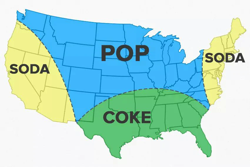
Holy shit, this is why Pixar won't make Sodas
Most of the country wouldn't get it
nah they can solve it with a regional dub for the midwest
the south is fucked tho, the Coca-Cola company is gonna cease and desist them
Then you clearly don't have a statistically-significant sample size.
Flags should have weapons on them 🇦🇴
Editing the California flag to have the bear rampant while holding a gun would rule
I think Angola's is technically a farming tool still.
Mozambique has a weapon 🇲🇿
Flags should have weapons on them
Hammer, sickle, and sword is extremely sus - mostly disagree on that one lol
What’s the sword one from?
Edit: nm, apparently it was suggested and Lenin argued against including weapons.
I think hammer, sickle, and sword is typically used by nazbol groups, but I may be wrong.
I’ve only ever seen the version that uses the nazi flag and replaces the swastika with a hammer and sickle, but with the amount of fascists with bad flags I’m sure somebody made the hammer, sickle, and sword version.
Vexology nerds who worship those stupid flag assessment guidelines are the stupidest people on Earth. Literally coping and seething that they can't enforce their rules on sovereign states and pretending Nepal doesn't have objectively the coolest flag.
i fucking hate CGP and reddit flag dudes "rules" so much. but i do kind of agree with straight lines--that wavy minnesota entrant was very unpleasant.
but my version of anti-wavy lines is only for the big solid-color bits. symbols--when they aren't a dogshit seal a governor's grandchild drew up in 1890--are great. California and South Carolina have the best flags in the union, and its because of their striking symbols taking center stage.
and i defend writing only if it declares the government type on the flag:
California Republic

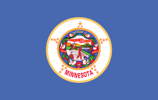
Minnesota... what the hell is a Minnesota? is it a kingdom?

e: oh and Colorado's flag sucks, the letter C is a dogshit "symbol"
oh and Colorado's flag sucks, the letter C is a dogshit "symbol"
i think the colors vibe
state seal flags aren't just boring, MN's is super colonialist and shit too (zoom in and peep the image of a stereotypical native man riding off into the sunset behind the colonist farmers)
He also made a video going over what was actually chosen (#3 but they made some changes that I hope he hates just because he's a dweeb), but it's paywalled
The final flag:
Show
I feel like the star changes are fine but I kinda liked the tricolor aspect
i hope they didn't drop the tricolour in response to that dumb tweet about the Somali flag, that'd be a pretty sad capitulation
 shit why'd you have to remind me
That's totally why they did it. Or some version of that vibe ("it seems too foreign")
I don't know about "completely" but I would probably have preferred a tricolor yeah
who cares it was a cooler flag. Pretty sure there's more tricolors outside of europe than in it
In defense of what they went with, I think the solid blue is much less cluttered than the tricolor. Also, when you get down to what the colors represented, Minnesota doesn't have a monopoly on snow (white), or forests (green). What it is notable for though, is having an outrageous number of lakes and for being the source of one of the most important rivers on the continent.
it'd have been faaaaar from the most cluttered state flag, and over-simplicity is boring. plain tricolor's are cool but anything else so simple just feels boring. Like, fair I guess but idk if I care if it has a whopping 5 elements instead of 3

I don't really care what other people from other states find notable about MN tho, those are still super defining aspects even if they aren't totally unique. Though I'll admit to not having huge love for the exact shades picked. I still don't like the super light blue, that doesn't look like water to me it looks like an artificial, color-picker blue, too vibrant, and the green was kinda meh, probably because it needs to represent northern pine forest, southern deciduous forest, and farmland, all in one bar of one color.
Oh also I somehow got it in my head that the final star design was going to be rotated 22.5 degrees and be like this which I preferred, though it might have looked weird without the tricolor
Show
He is right that flags should only have straight lines and simple geometric shapes because the only interaction 99% of people will ever have with state flags is drawing them during busywork elementary school assignments.
But his extremely reddity argument of every flag has to have straight lines is so stupid.
liberals are indistinguishable from soulless ChatGPT bots #3948230940238526
i did the same thing joel did :madeline-sadeline:
the worst was clearly the one on the left, ms paint looking fucker of a flag
We should do away with national flags altogether and have the flag of a given region be the personal standard of the executive. So the US flag would be Biden's coat of arms, and the Minnesota flag would be governor Walz's heraldic device.
Of course, this would only really make sense if we also did away with any pretense of democracy and just had noble families who would rule a given region for a long period of time. You know, just so the flag isn't changing constantly. Which I am also suggesting. Look, it's not my fault that an aristocracy is just more aesthetic. Also insert here Sideshow Bob rant about Americans wanting to be ruled over by a king.
As a joke. Ha ha. Unless... no, just joking. Unless?
WHY COULDN’T THEY GO WITH THE NORTH STAR DESIGN, SHIT’S BEEN MORE WIDELY USED THAN THE OFFICIAL ONE SINCE LIKE THE 90S
I found a YouTube link in your post. Here are links to the same video on alternative frontends that protect your privacy:


.svg)