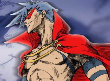
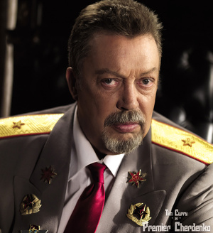
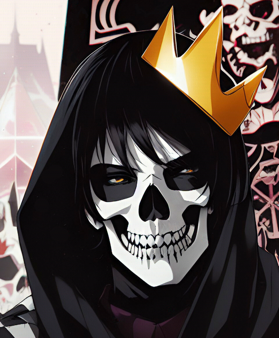
Something simpler would look better at that size imo :gui-better:
None of these are actually going to work very well rendered in the form of embroidery. They're all too detailed for the medium and lack readability at scale.
I highly recommend previewing embroidery by setting the image to the PPI of the resolution of the embroidery machine, scaled to the appropriate size, then put the image onto your phone at the right dimensional size and hold it out at arm's length.
Left or middle would be good, I like seeing the guy there for some reason. It makes it feel like less of the focus is on the mechanism of execution and instead on the people who are involved.
Left or center, the dude makes it feel like a threat
I'd change where the rope ends though it makes him look like he's got one clown shoe or something
In order from left to right. I think it would be hard to tell what the right logo was in stitching, or even if I just saw the image without the other two for context.
left but I feel like the blade could be a little darker (if the shirt is going to be white)?


