Well they're measuring poll data of Biden versus Trump in a general election. Their data stops in November of 2020 because Biden won that election and there hasn't been polling comparing them as presidential candidates in three years.
The space from Jun 2020 to Aug 2020 is smaller than the space from Aug 2020 to Oct 2020. Jun 2023 to Nov 2023 is smaller than either of those. This chart is all sorts of fucked.
Upon closer inspection, this seems to be two different graphs with white backgrounds placed against another white background with an ever so slightly different shade of white. This is still a scummy way of showing graphs.

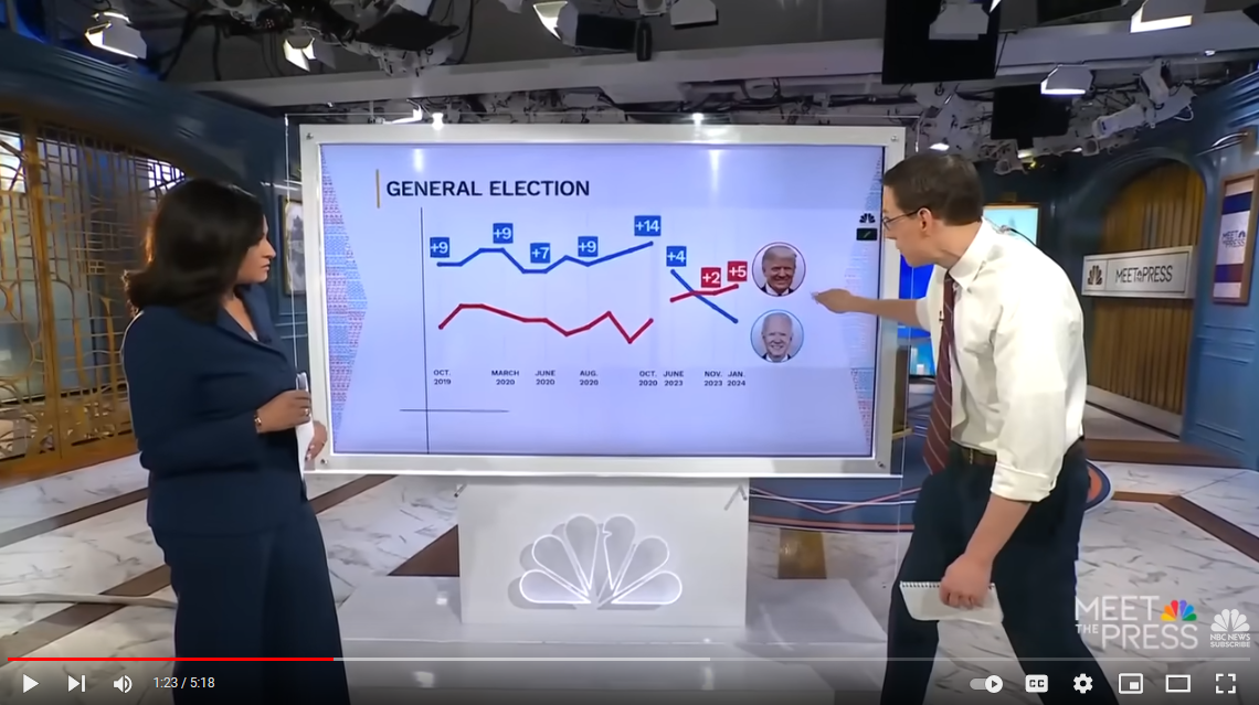
What the hell is this chart? Why did they just skip 3 years of data??
Well they're measuring poll data of Biden versus Trump in a general election. Their data stops in November of 2020 because Biden won that election and there hasn't been polling comparing them as presidential candidates in three years.
They are skipping around a lot though
Thats some Fox news selective data smoothing shit right there.
The space from Jun 2020 to Aug 2020 is smaller than the space from Aug 2020 to Oct 2020. Jun 2023 to Nov 2023 is smaller than either of those. This chart is all sorts of fucked.
Upon closer inspection, this seems to be two different graphs with white backgrounds placed against another white background with an ever so slightly different shade of white. This is still a scummy way of showing graphs.