N64/Gamecube era: I'm going to hype you up with a cinamatic intro and also I'm going to render a whole interactive 3D space with a catchy theme song for my title screen and save select screens.
Modern era games: Lol heres a .png of our promotional art and a piano tinkling. No intro.
I'm getting old.
millennial boomer-posting hours
remember when video game manuals were like 100 pages long and glossy/full-color
I liked learning details about the characters or world that didn't show up in the game itself (hello, Final Fantasy 1-12). Now they just use in-game codices (hello, Final Fantasy 13-present)
I get it, but in the defense of PNGs, if you've ever set video setting too high and had to navigate menus at .1 FPS or had it start crashing on launch because it can't render the menu scene, fixing it can be painful.
This! The worst is when you install a new PC game and they have decided, for some reason, to make the default video settings:
- Windowed mode, as in a little window on your desktop
- 1280x720
And when you start this game it begins playing a dramatic cinematic intro.
800x600, full screen, 4:3, all minimum settings, and when you apply new settings the game hangs for at least three seconds with the button click noise repeating like a skipping record.
 source engine games
sorry I can only consume the subject of this post in the form of a 45 minute video essay
I prefer the "4 hour video complaining about a 90 minute movie" format, myself
Metroid Prime main menu still goes fucking hard https://www.youtube.com/watch?v=tjP0Ht9jReA
Star Wing (Star Fox in the rest of the world) Had some badass IRL toy models made for the box art!)
You must be close to my age (on the younger side of the millennial spectrum)
Show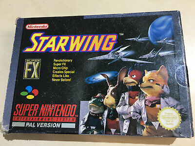
bibeo gaymes are such a serious business now, if you don't have a SERIOUS screen for SERIOUS GAMEY then it's bad and not prestige enough
i too miss cool screens with banger menu musics

Blew my mind as a kid to see the background in Half-life 2's main menu change to match the level you were on.
So I was chatting with someone about this the other day and it's a double edged sword. I was talking specifically about marketing and labelling but it applies here too. The trend in all design right now is simple and clear. This is boring as fuck. It's not fun. It just...is. And that sucks.
However the big reason design is going that way is ease of access. The simper something is the easier it is for more people to use and understand. If your product is just a picture of a bowl of macaroni and nothing else, everyone should know what's in there even from a distance. If your menu is simple and clean anyone should be able to figure out how to use it. Etc etc
So it sucks and it's not fun at all but it does make the product easier to access which is good too.
I have seen people who paralyze and defeat themselves by saying video games are too complicated for them. The girl who rates videogames for her boyfriend cried after defeating an Elden Ring boss because she thought video games weren't for her (can't find the clip). It corroborated what I saw in a video essay about a person talking about his girlfriend struggling because her lack of interaction with 3D spaces meant that some of the language of gaming was lost on her.[1]
I can get higher than anticipated and interference with a non-linear dungeon in TOTK where I have to build my own solutions. Having absorbed the metaphor, it felt like I was having a conversation with the devs. If you don't have that understanding of how a videogame operates and what it wants from you, then it's much harder to grasp and you might find yourself getting nervous about being watched and get lost in a linear corridor.
At some level I think they need a new player to, more seamlessly than you'd think necessary, be shunted into a tutorial so they see that the controls are intuitive and the objectives are clear.
[1] https://youtu.be/ax7f3JZJHSw
A bunch of games I'm playing these days have fun menus. Darktide, Helldivers, and Deep Rock Galactic all have hub areas that act as menus for selecting missions, upgrading your stuff, dressing up, and chatting with other players.
I love getting absolutely smashed in the Deep Rock Galactic lobby bar while waiting for my friends to setup their stuff.
They're fun. All the stations in Darktide have a voiced NPC, and most of them will be your mission coordinator in some missions, so it ties the interactive menu area in to the actual gameplay. The helldivers menu area is the bridge of your space ship where you choose what planet to bring LIBER-TEA to, then everyone jumps in to their drop pod to start the mission.
bring LIBER-TEAaccidentally mulch all your teammates with your mech's autocannon.I was really worried about the sequel announcement until i watched it a few times and saw at least a half dozen team-kills.
dope-ass cinematic of link tooling around hyrule field on his sick ride

static promo shot of link's ass

I think part of this is because you use menus way less now that consoles have sleep modes/ quick resume. Like I played TotK for 100+ hours but I maybe used the main menu like 2 times bc I could just wake my switch and resume right where I left off. For old games you had to use them every time you played the game
