In the sense that nothing about the architecture or art really evokes Japan at all other than that it looks vaguely Asian. (Some bits feel more Chinese than anything.) This is a big budget 2020 game with art done by contracted artists from all over the world, you'd think they'd be able to get a little closer than this, especially with how overexposed Japanese culture has been for a long while now
Orientalism. That's the word you're looking for. The game was made by orientalists.
It's just wild to me that a game this modern would fall back on generic vaguely Asian slurry. I'd expect this from a game from the 90s but even the China levels in Crash 3 felt more like China than this does Japan
Ironically, an LLM would probably make something that would look more convincingly Japanese at a glance
This just feels really lazy and clueless to me, like how a comic from the 1970s would depict an Asian country
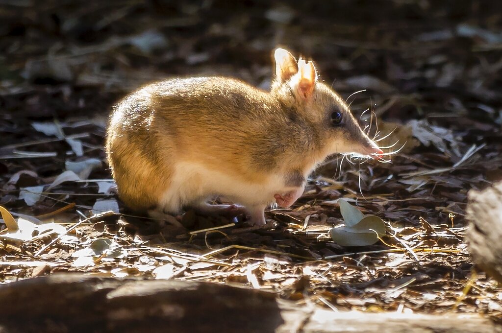
I used to think bandicoots were made up for the game
look how cute they are
Show
Honestly I wouldn't have even guessed this is supposed to be Japan. I think the wonky towers in the back look kind of neat.
That is about the bare minimum for having assets in the level...
This was from a level intro before crates and enemies were spawned in, so it's not quite this barren when you're playing
They at least read as "China," same with the Arabian, ancient Egyptian, etc levels


