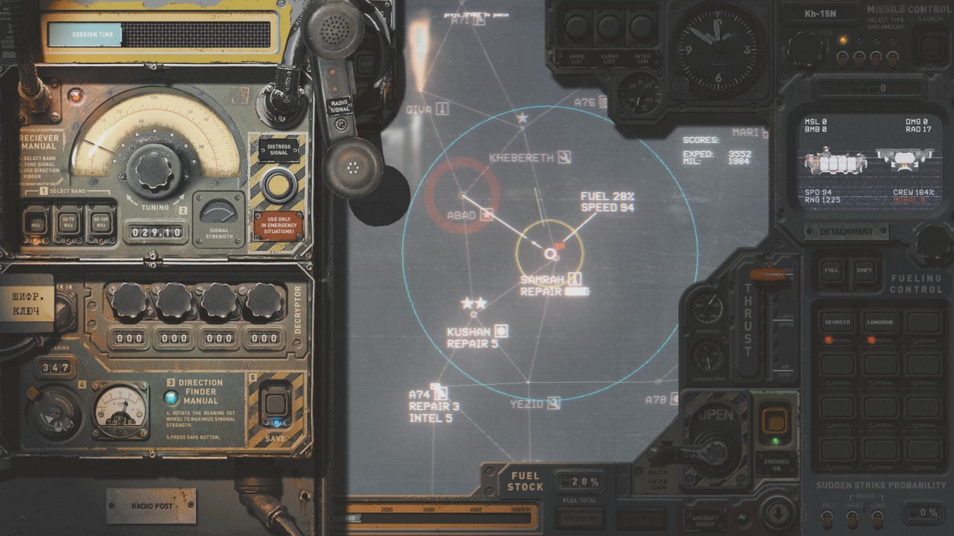
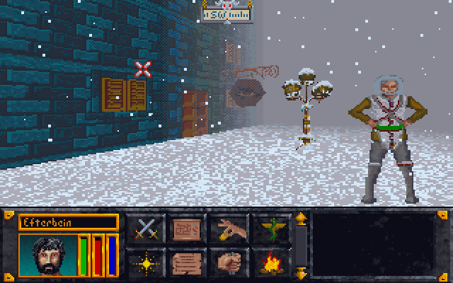
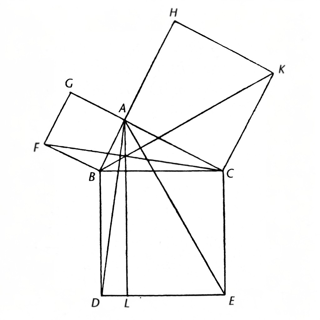
https://bsky.app/profile/dungeonbitch.bsky.social/post/3ldfegy3ejc2u
for me, it's having some kind of gargoyle or angel/demon statues on the edge of your HUD holding up your health and mana
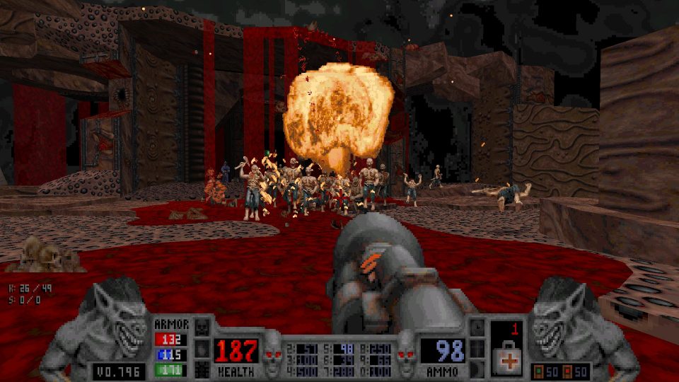
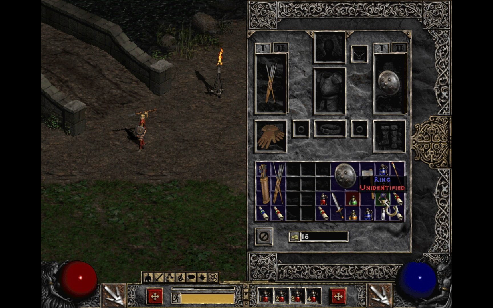
Warcraft II was peak game UI design and it has been downhill ever since.
- Show
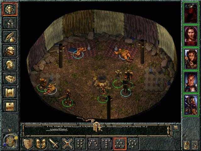
BG 1&2 were my comfort games I loved them so much. Played it back when it came out as a kid and man, this will always be what gaming is to me.
Last thing you hear before getting owned by those thieves shooting ice arrows at you.
real heads downloaded gauntlet cursors off geocities fan sites and made it their windows cursor
rofl the bit about cursors reminds me of when I was 10 or something and downloaded an animated ultima cursor pack on my dad's work computer. he was a bit mad
Fallout

🇵🇸 [click me] ... updated December 20 🥺
Please help Ibrahim in Gaza ❤️🇵🇸https://www.gofundme.com/f/getting-food-for-my-brothers£2,409 / 10,000 (last donation 14 days ago!) 🥺
Please help Aya in Gaza ❤️ 🇵🇸https://www.gofundme.com/f/support-mohameds-family-to-reach-safety-outside-gaza$40,036 / 65,000
Please help Mahmoud from Gaza ❤️ 🇵🇸https://www.gofundme.com/f/help-me-build-my-future-and-build-my-family-home$10,109 / 15,000
Please help Alicia in Gaza ❤️🇵🇸https://www.gofundme.com/f/younis-family-relief-and-evacuation-from-gaza
$7,405 / 35,000
Please help Yamen in Gaza ❤️🇵🇸https://www.gofundme.com/f/help-yamen-undergo-surgery-in-gaza
£56,429 / 62,000


(work in progress 🚧)System Shock having a psi meter that didn't actually measure anything relevant to the game was peak UI design.
the 1st one (OG or remake?) or the 2nd one?
cause i don't remember there being any psi stuff on the 1st game. maybe a bunch of lines on the top-left (some of the lines were relevant, like one of them is affected based on how much stamina you had left)
maybe a bunch of lines on the top-left
One of these was marked psi (EDIT: I misremembered, it's actually labelled "Chi brain waves"), it didn't measure anything and most people just toggle off. In the remake of System Shock you don't start off with it active but it can be found close to where you wake up after the intro, it still doesn't measure anything.
When the UI is all black semi-transparent rectangles with off-white text/icons

Retvrn to whatever this is
Show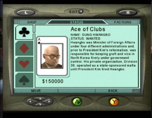
I agree so much! Sure, there's some "friction" when you want to open your menu in a narrow hallway and have to spin your character around a little to actually see it, but honestly? I find it great and immersive and cool. Dead Space is just really good, really
Everything that's not absolutely necessary gets sanded away as the rate of profit falls.
For a relatively simple example, though, I like Brain Lord:
Show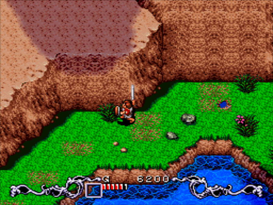
Atlus has been killing it with their UI design since Persona 5 tbh
I found YouTube links in your comment. Here are links to the same videos on alternative frontends that protect your privacy:
Link 1:
Link 2:
thanks babe sun's up another day goes by look at the time fly comment vous dire? La vérité fini toujours par se découvrir, À chaque jour suffit sa peine, Chacun trouve chaussure a son pied, Le temps blanchi les têtes sans mûrir la raison.
I've been playing yonder Pocket Monster Pocket card phone game and the UI is so fuckin sterile it makes me wince. Got me thinkin' about the map from Pocket Man Stadium


