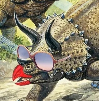
This crying mother character would have fit right in among the rage comic characters. I think this template might have staying power.
Fuck material design. Fuck Google. I don't know if this even qualifies as material design but fuck material design anyways!
Yeah, I love Firefox, not sure how I feel about this new Firef̷̬̜̯̲̣̘͓̗̓̎̋͘͝ơ̴̙̝̊̈̍̈́̀͐͛̂͛͠͝x̶̢̛̱̻̮̼̒̒̔
The super simple icon is just the proposed company logo. The other proposed one is a fox head. The browser logo won't change from what it is now
Oh okay that's not so bad then, still not a fan of the new design, but that's just a personal preference thing.
Yeah, it's kinda dumb. I understand the desire to simplify the logos though. Especially in the case of open sourced stuff that also has a lot of other programs involved. Makes it easier for people to create simple icons in the "style" of the root app.
Yeah, I can appreciate that too and I mean for letter heads and stuff it probably scales better. But, to take a lib saying I wish "they would try to find a compromise" between a simple design, and one that includes more obvious elements from the original. Like you mentioned the fox head before, seems like a decent compromise that is still easy to relate to Firefox.
Yeah, seems like that option is the more favored one right now. Most people agree that the Edge ripoff is garbage lol
Haha shit, I hadn't even thought about the fact it's reminiscent of Edge. Definitely good choice, hard avoid all Edge-ralted activity.
I think that first one would look great now on high-DPI screens, but it was a cluttered mess during its time when it occupied like a 32x32 pixel area.
The problem is that they're designing for tiny phone screens, not PC screens. We're seeing the gameboyification of software UI design.
It is going to sound pretty lame to be upset about this, but I fucking hate this trend with everything. Be it logos or buildings. Everything is just utilitarian bullshit to make it look "clean". Fuck this style.
Next its going to be colorless.
I would prefer clean to the overbusy, 4 different textures with 5 different colors trend in buildings
It’s odd cause Firefox browser keeps the fox we know, but Firefox as a whole gets the tail logo.
Yep, it’s like umbrella logo for all the Firefox services. Here’s their blog post about it.
What is with tech people and fancy iconography, why do I love looking at these icons so much :strangelove-wow:
Soon it's gonna be just an orange dot and a blue dot on a transparent background.

