![]()
Being photographed with the pope is equivalent to being photographed with Epstein

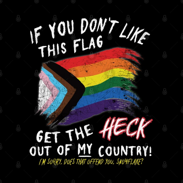
The original pride flag and the trans flag are awesome flags. The new one looks too busy and the symbolism is contradictory.
I tend to think the best option is if there’s two flag poles is the original Pride flag and the trans flag should be flown to show solidarity. But either progress flag is good when you don’t have space, I’m flying a progress flag right now.
The Pride flag by itself has been co-opted by capitalists and some TERF organisations. So seeing one by itself can be suspicious.
(Also only tangentially related I think the gay flag with the pink triangle on black and the lesbian flag with the black triangle axe and purple background go much harder than the newer progress flags for those groups)
You have the rainbow which literally means something along the line of "the entire spectrum". That is a neat, simple symbol that can include everyone in the LGBT+ community — But that symbolism doesn't work when you also want to be able to point to a specific area of the flag and be able to say "this is for that particularly group", "this is for that other particular group".
I applaud the intention to be more inclusive of trans and bipoc people and I'm not trying to be dismissive of the unique challenges they face. I'm just kind of mildly grumpy that a side effect of this is worse flag design.
My take on this is that despite the rainbow already being inclusive, trans people, intersex people, or people of color get skipped over, so it's not bad to reiterate the point.
It's because just sticking a rainbow on a flag is actually not a good approach to flag design.
I actually really like the way that the Chevron breaks up the stripes of the rainbow. However, a better designed flag would make the chevron a single color.
Before he died, Gilbert Baker suggested adding a lavender stripe for Diversity to the rainbow flag. I say make the Chevron a single lavender color.
In lieu of that though, I like the progress flag in the way that I like the flag of Maryland. It's so bad it loops back around to being charming.
If I want good queer flag design, I'll go to the bi, trans, and intersex flags. Most everything else is garbage tbh. For a group of people stereotyped as having an eye for aesthetics, we're garbage at flags.
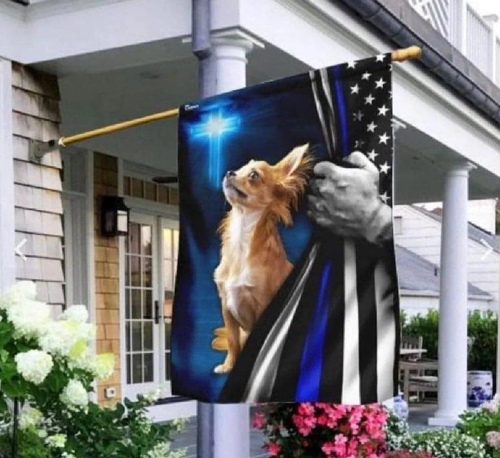
The hand is that of a cop, pulling aside the curtain so he can shoot the dog while it is too busy praying to notice him.
Yeah pupper background looks like Patrick swayze's afterlife in ghost
yeah i'm really confused.
the dog looks terrified on top of everything else
It's so kitch it's come around full circle to the point of it becoming an absolute masterpiece.
