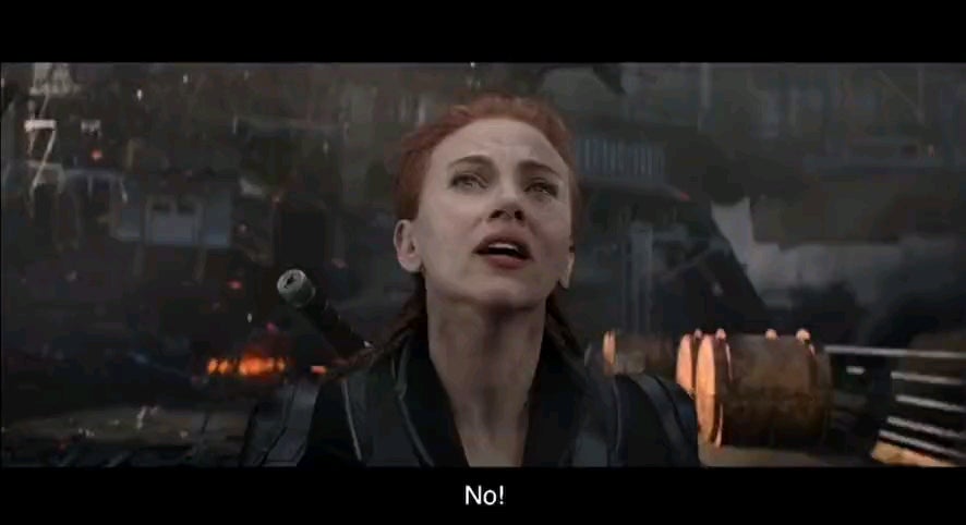
Oh sweet the new Neil Breen movie is out
:michael-laugh:
It's funny because this is all we're going to be getting in theaters until civilization collapses but they can't even do the cg right.
Meanwhile, Bo Burnham out here making art alone in his guesthouse with probably less than $50k in an equipment budget or whatever.
To each their own. I end up watching some of the Marvel stuff too, and there's just nothing interesting there for me to think about.
Ocean on Fire (2040) will have a $1 billion dollar budget. And an equally impressive story...
When a very, very big fire threatens to dry up the oceans, NASA honcho Dan Truman determines the only way to stop it is to drill into the ocean and detonate a "put it out" bomb. This leads him to renowned driller Harry Stamper III, who agrees to helm the dangerous underwater mission provided he can bring along his own hotshot crew. Among them is the cocksure A.J., who Harry thinks isn't good enough for his daughter, until the mission proves otherwise.
It's funny because she just blew herself up and ended up without a scratch at the end.
No super powers btw lol
Can't have stakes or consequences for any actions because you can't create spinoff shows for dead side characters
Right?
Stop being so fucking lazy. If you want to have high stakes, create situations that are believable for the characters. Instead of having a tank ram into a car at high speeds, rolling a dozen times and have the main character not be hurt (also in this movie).
Have something realistic. Have her break her leg or get shot and lay incapacitated reservoir dogs style.
So annoying. Everything has to be so scaled up. Why did the Red Room have to be a floating castle that blows up and falls down? Why can't it be inside a CIA base? That's more realistic and way more interesting as a plot line.
I guess this is just movies now. I don't know how you can escalate from the world ending every movie.
And they're just increasing bloat by saying that there are all these shadow wars happening. Secret agents. Magical covens. Extra-dimensional monsters. Like I get that's how comics are, but you'd think people would be bumping into people more often.
someone needs to make one of those "genre-killer" movies for cape shit already so we can just move on.
I love superhero movies. Not because they're good, but because they're nostalgia. That being said, too goddamn many of them.
I'm hoping for a few movies/shows like the Boys that bring a more cynical look at superheroes. Because when you think about it, this world is shit. This world would be much more terrifying with superheroes.
Fuck, I started typing this and immediately forgot they made prequel comics and an HBO sequel of Watchmen
and they were terrible because DC should've given Alan Moore the rights to the IP in like 1990 but instead waited til like 2010 to ask him if he'd be willing to do a prequel & sequel series for the rights back lol. :no-copyright:
red guardian played by david harbour has lenin's face tatooed onto his forearm and has "karl" on his fingers on one hand, and "marx" on the other. red guardian is the soviet version of captain america, super soldier serum and all that
I like the sound of that- how do they make it terrible?
He's kind of an ass but they don't really shit on the USSR at all.
Also I swear he says he's in jail for complaining about the actions of the party, which I can only assume was the revisionism lol
I think part of it is that they seem to conflate the super secret projects with the ideologies of USSR itself. They're doing evil super-science not like the super-science that made Captain America. David Harbour's character is proud of the body counts they accomplish more than accomplishing specifically anti-capitalist things. It's what they're not saying.
I guess, but the dude does feel kind of betrayed by the bad guy and Russia as well at the same time.
I did also notice that the film is very much like "the evil USSR had a brainwashing program that turned people into soldiers" and that leaves a bad taste in my mouth when MKULTRA is literally a thing that exists.
I do hate the Marvel movies. I think they're lifeless, boring, trite stories. But I constantly wonder if my dislike of them just stems from getting older, from my tastes growing more specific, from becoming more and more myself. When I was a kid I loved summer blockbusters. Pirates of the Caribbean. Star Wars. Harry Potter. I can't remember what else there was. There must have been something? Pixar, I guess? Anyway, were those movies really any better than Marvel is now?
Yes. They were.
It's the children who are wrong.
So, I get that it looks bad -- I look at it and I get this feeling like it's cheap in some way -- but I'm not sure exactly why it feels that way. Like the Plinkett line, I didn't notice the mistake, but my brain did. Would someone be able to point out exactly what's wrong with this scene?
It's subtle lighting and motion shit that you gotta be kind of an expert to know the words for - or even to consciously recognize.
Taking a crack at it:
First shot: her face is really blurred into the background
Second shot: The tanks and shit behind Scarlett Johansson are lit orange like a sunset from the left, but she just has soft cold lighting on her
Third shot: Just weird, Idk the smoke is really clearly edited in poorly, and she's so static in the frame, like it's just a lazy amateur shot.
Fourth shot same as second shot. Fifth same as third.
Sixth shot where she stabs the thing is too blurry and fast to really tell if anything is wrong.
Seventh shot when she starts flying back, there's a fucking GIANT EXPLOSION IMAGE BUT IT'S 2 FEET ACROSS. Look at that explosion. It's a 20 foot fireball effect but they made it tiny. She's also lit evenly again. In front of a fiery explosion. Motion is starting off really weird.
Seventh shot, she's being fucking lit on the FRONT OF HER BODY even as her body awkwardly turns away from the explosion. It starts 90 degrees wrong, ends like 170 degrees wrong. They just rotate her image cutout. They also fade the orange filter on her body a bit after the explosion stops glowing. It's out of sync.
There's also just such a detachment from the background. It's absolutely cheap as shit - nothing tying anything together - you just have background, exploding thing, explosion, character, and random shitty dust. It would have taken more work to blend everything into a coherent setting where the foreground fades into the background. Every shot is just someone standing chest high in front of a green screen yelling with a fan blowing on them.
Really fuckin bad. These studios have more money than God so they're probably embezzling a lot of it or whatever, buying children for adrenochrome, whatever.
Every shot is just someone standing chest high in front of a green screen yelling with a fan blowing on them.
George Lucas and his consequences have been a disaster for the human race
Part of it, at least what I'm seeing is the awkward framing of the actors compared to their backgrounds when close up. Their hair's blowing in the wind, but it's clear they're not really there. Then with the explosion, the actor's flying back super awkwardly.
If there are other issues, I can't articulate them well myself. It's just bad. Like those instincts you have that things are off.
Th cgi is meant to be bad. Its capital alienating on-set from off-set labourers so it can pretend to not be a leech in the film making process. Its why award for s effects are often handed out to films while the studio who made those effects went bankrupt.
